Expanding cultural heritage.
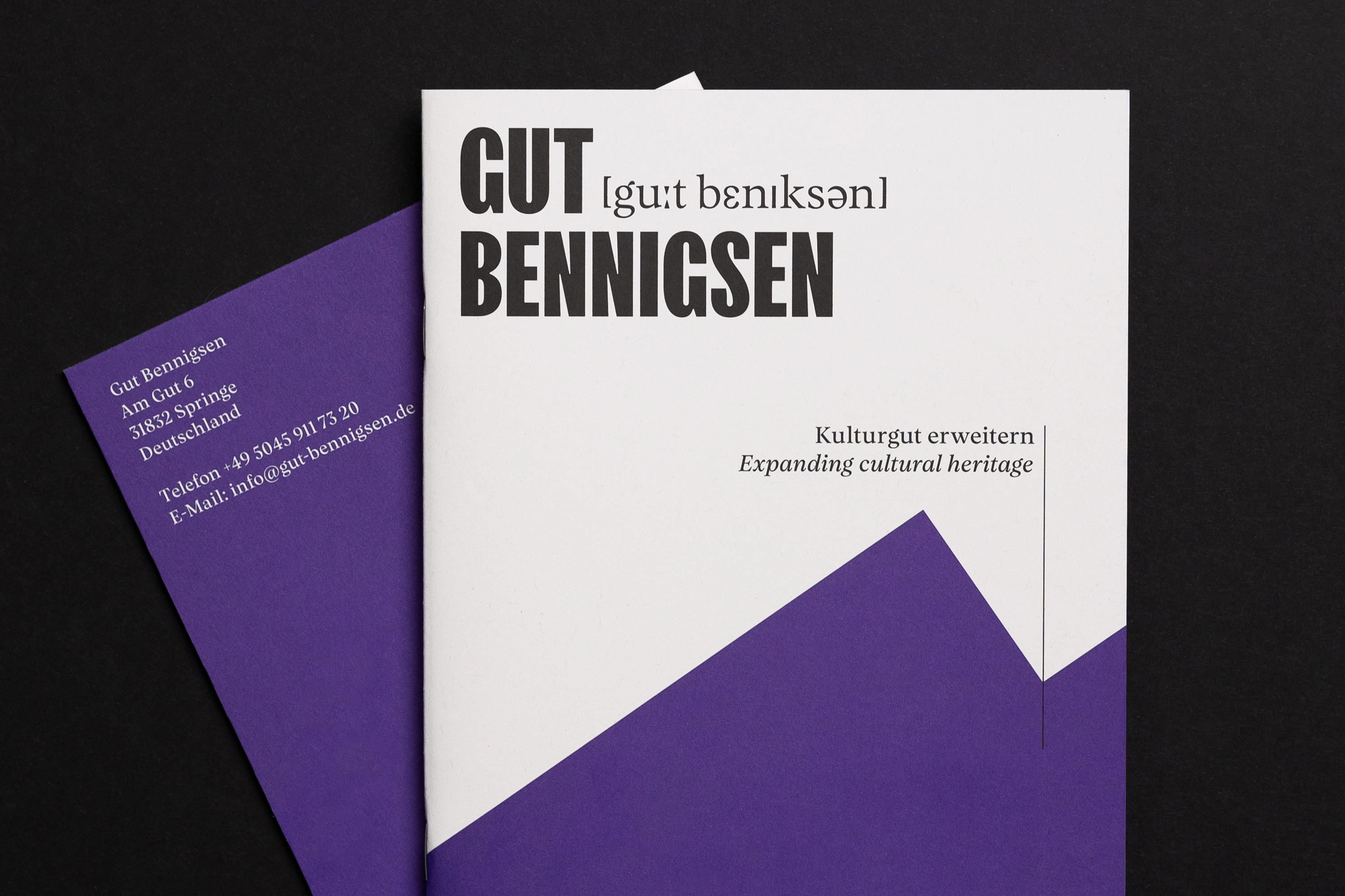
Gut Bennigsen – Brand Identity & Marketing
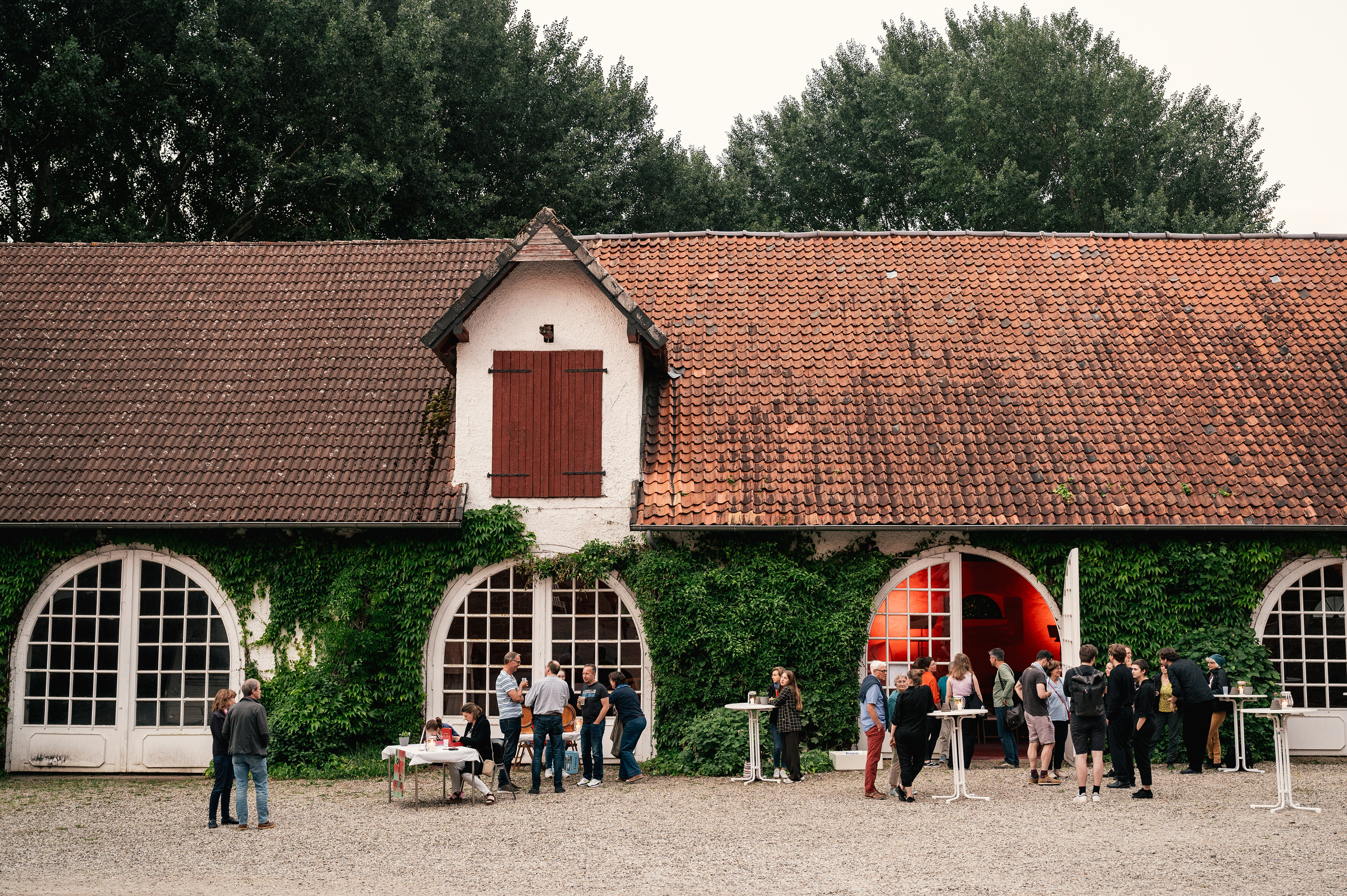
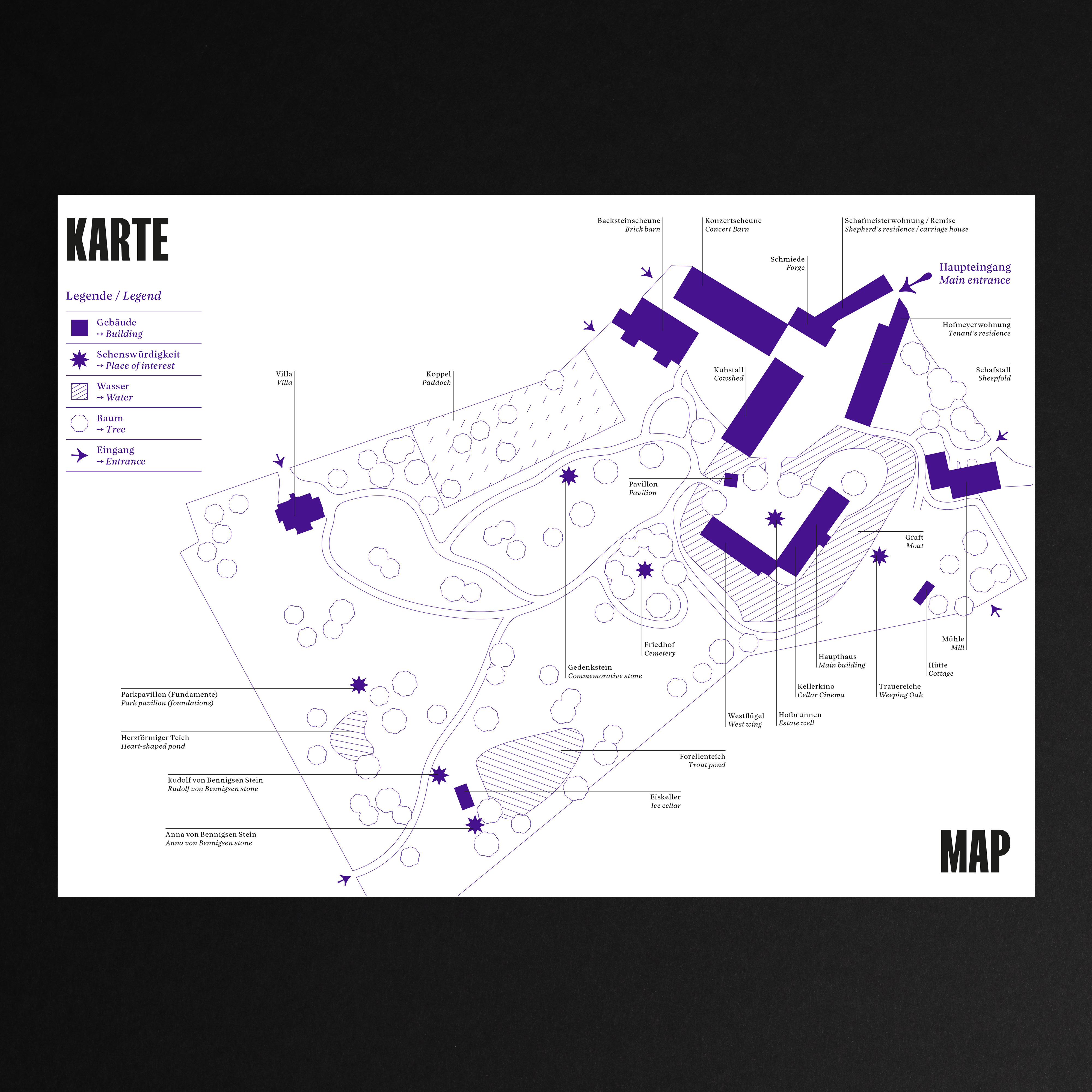
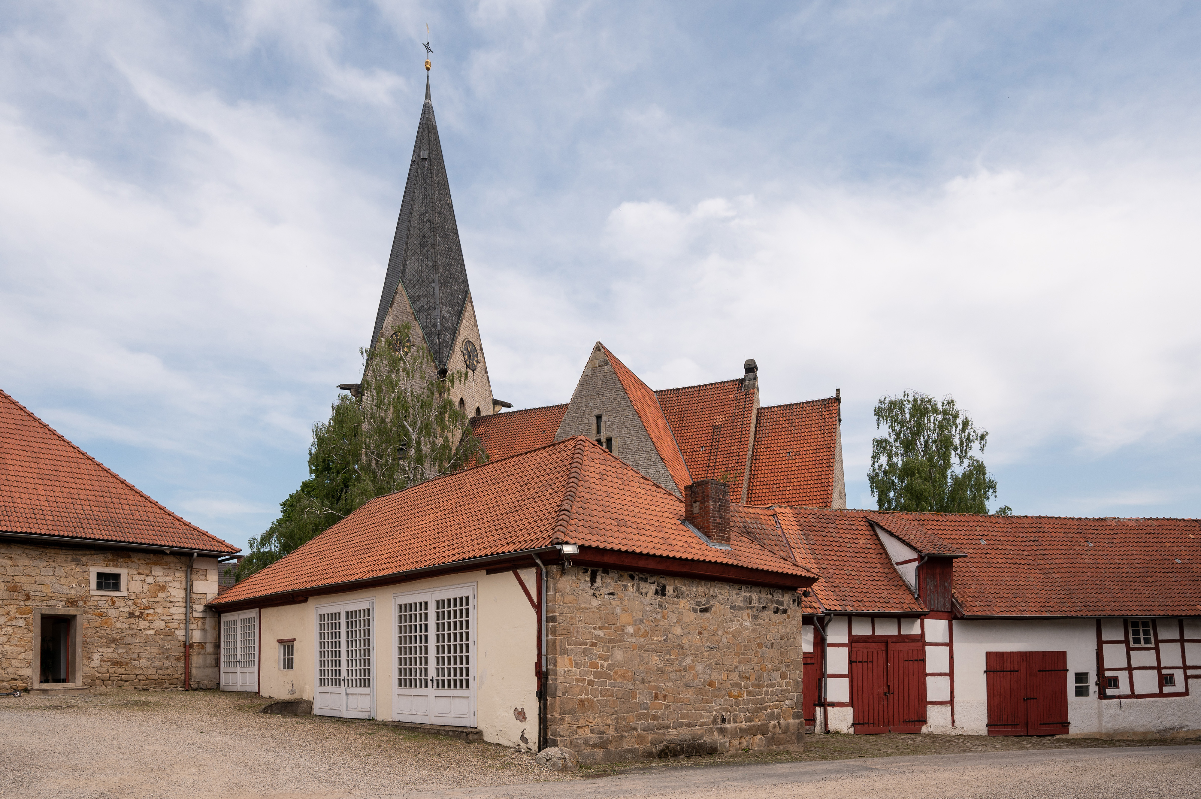
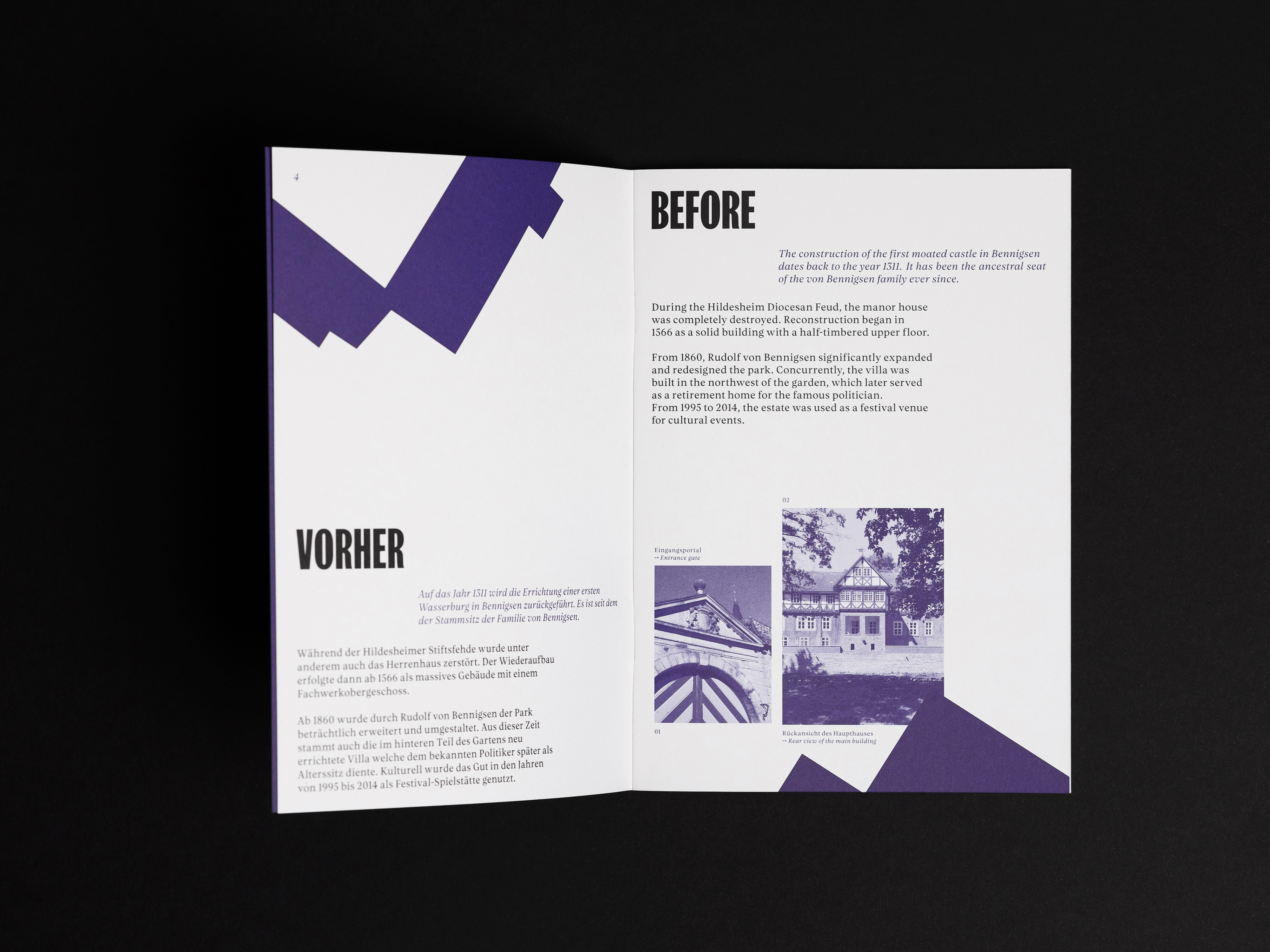
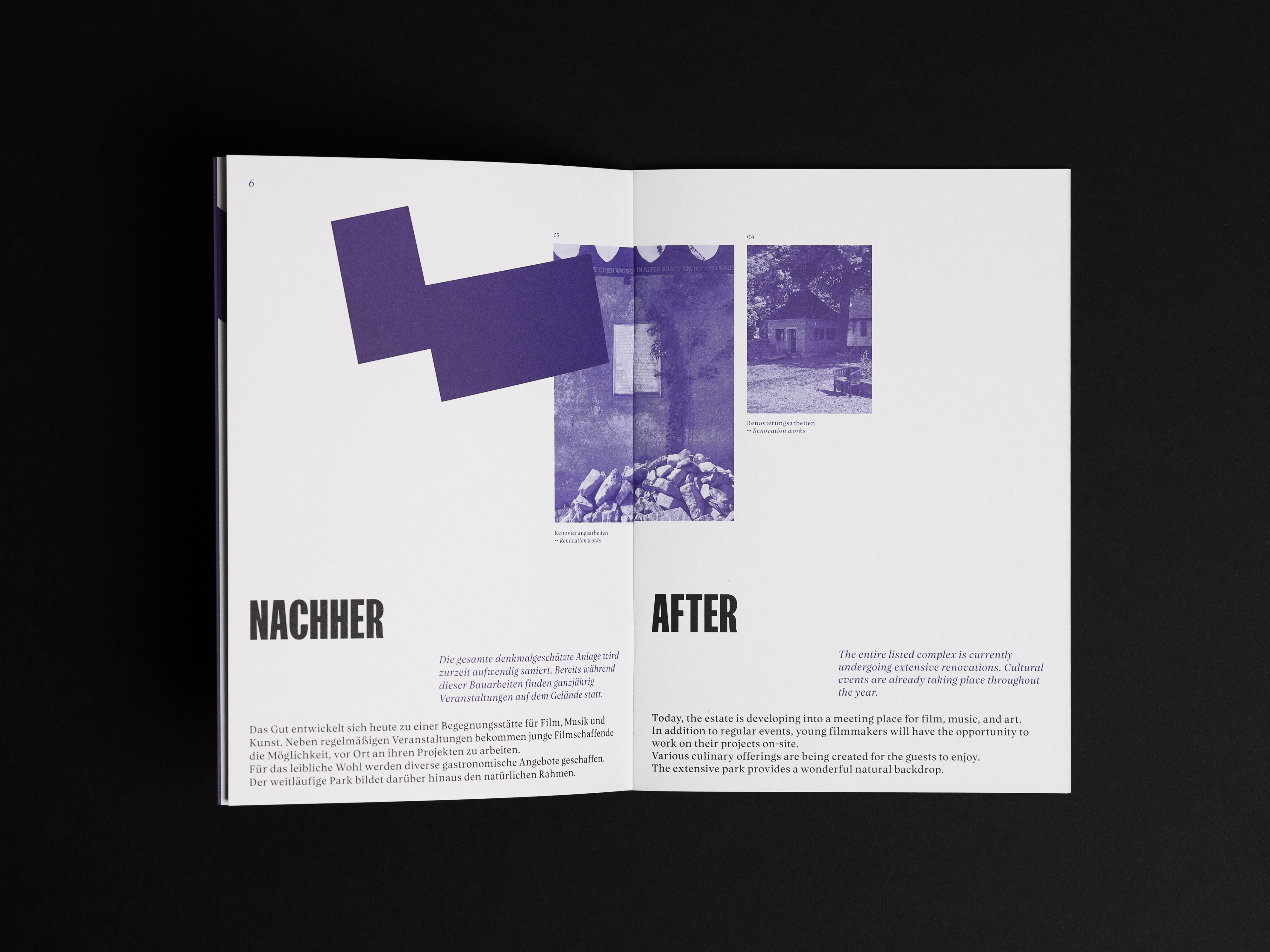
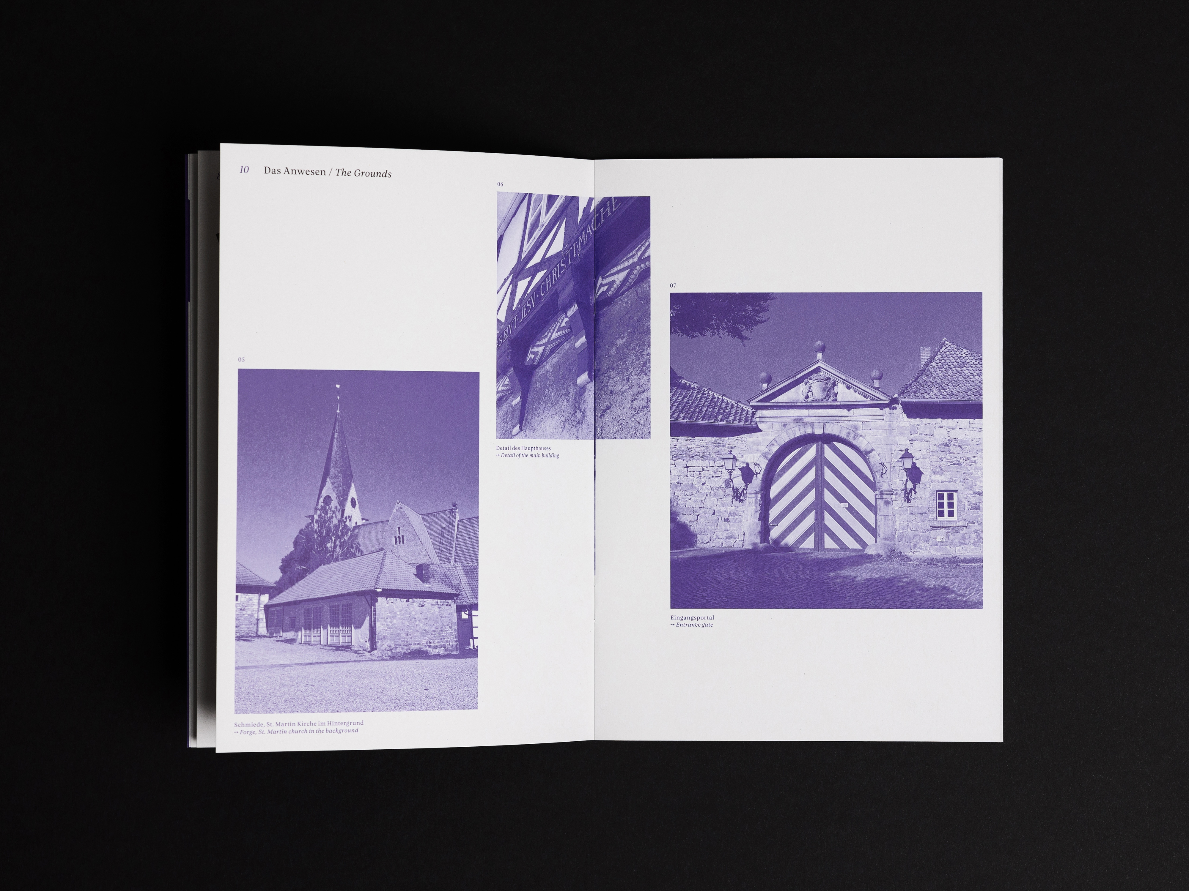
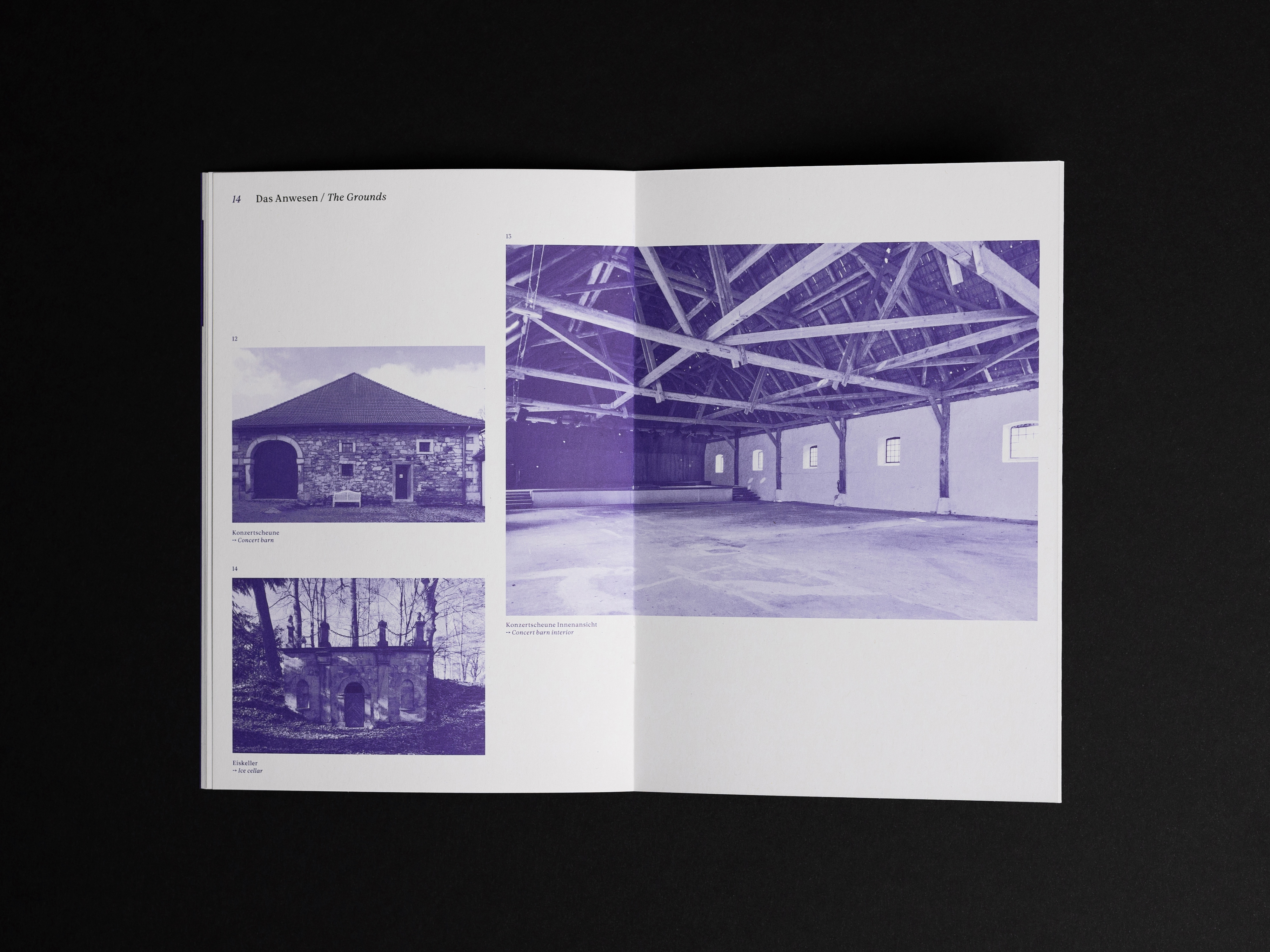
Gut Bennigsen is an old knight’s estate in the countryside near Hannover, Germany. In 1311 the manor was first documented in the possession of the family “von Bennigsen”.
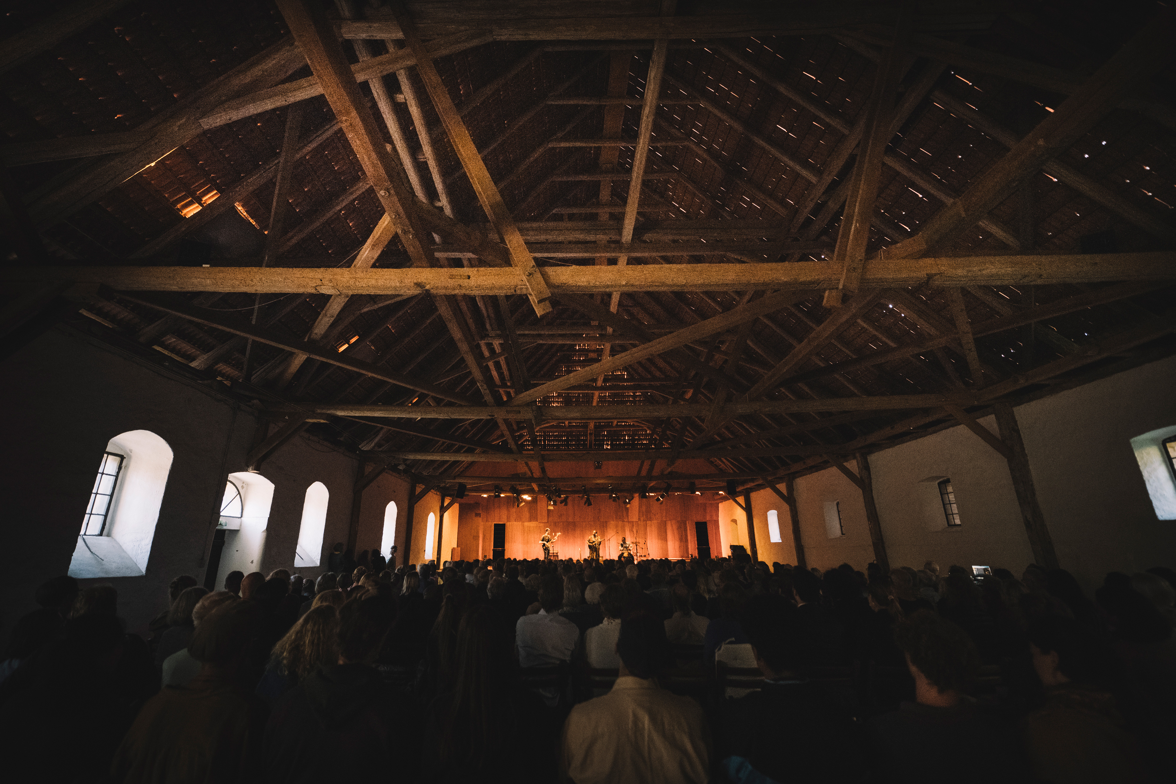
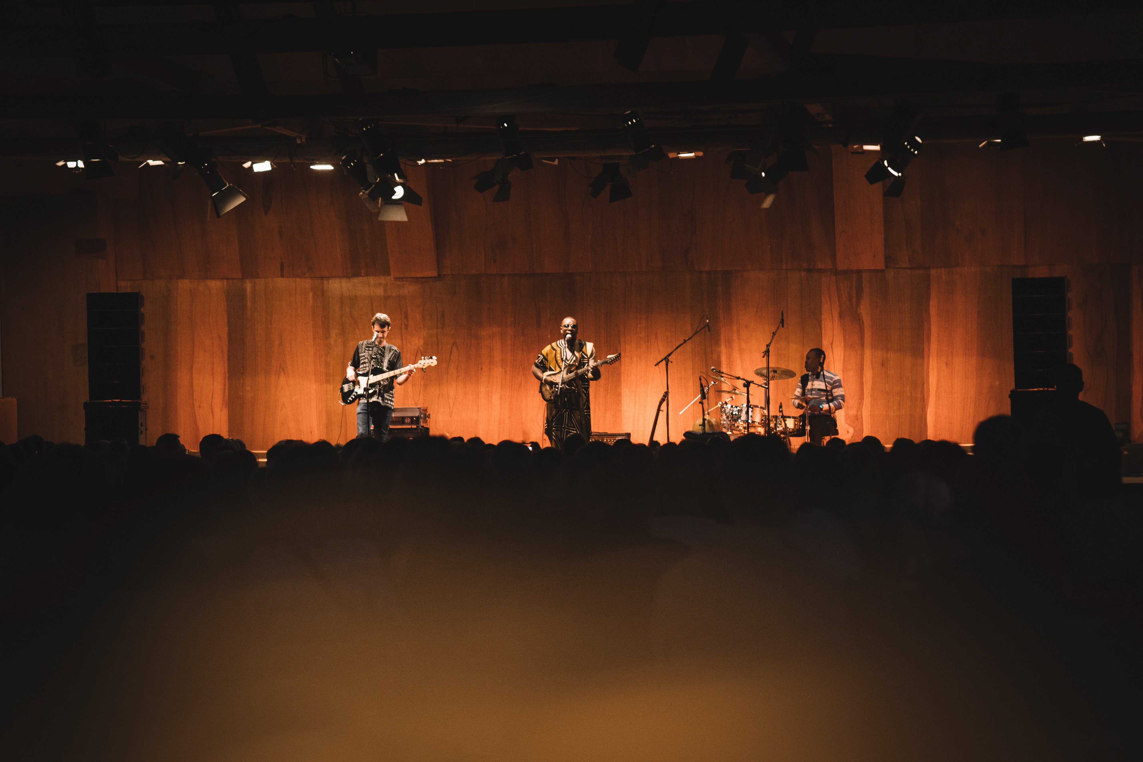
Since one of the decendants inherited the estate some years ago, he turned into a multi-purpose cultural hub. Now different types of events and concerts are held regularly on the grounds, with further plans to expand the experience.
Transatlantika created a visual identity, an informative website and promotes Gut Bennigsen with multi-channel marketing campaigns.
→ Briefing
The owner of the estate grounds approached Transatlantika to develop a name and visual identity for his undertaking. Both had to allow the communication of a variety of uses (events, concerts, residencies, gastronomy, etc.).
→ Process
Parallel to discussing different naming suggestions, we presented various design directions. After some personal and virtual meetings we found a fitting look.
→ Solution
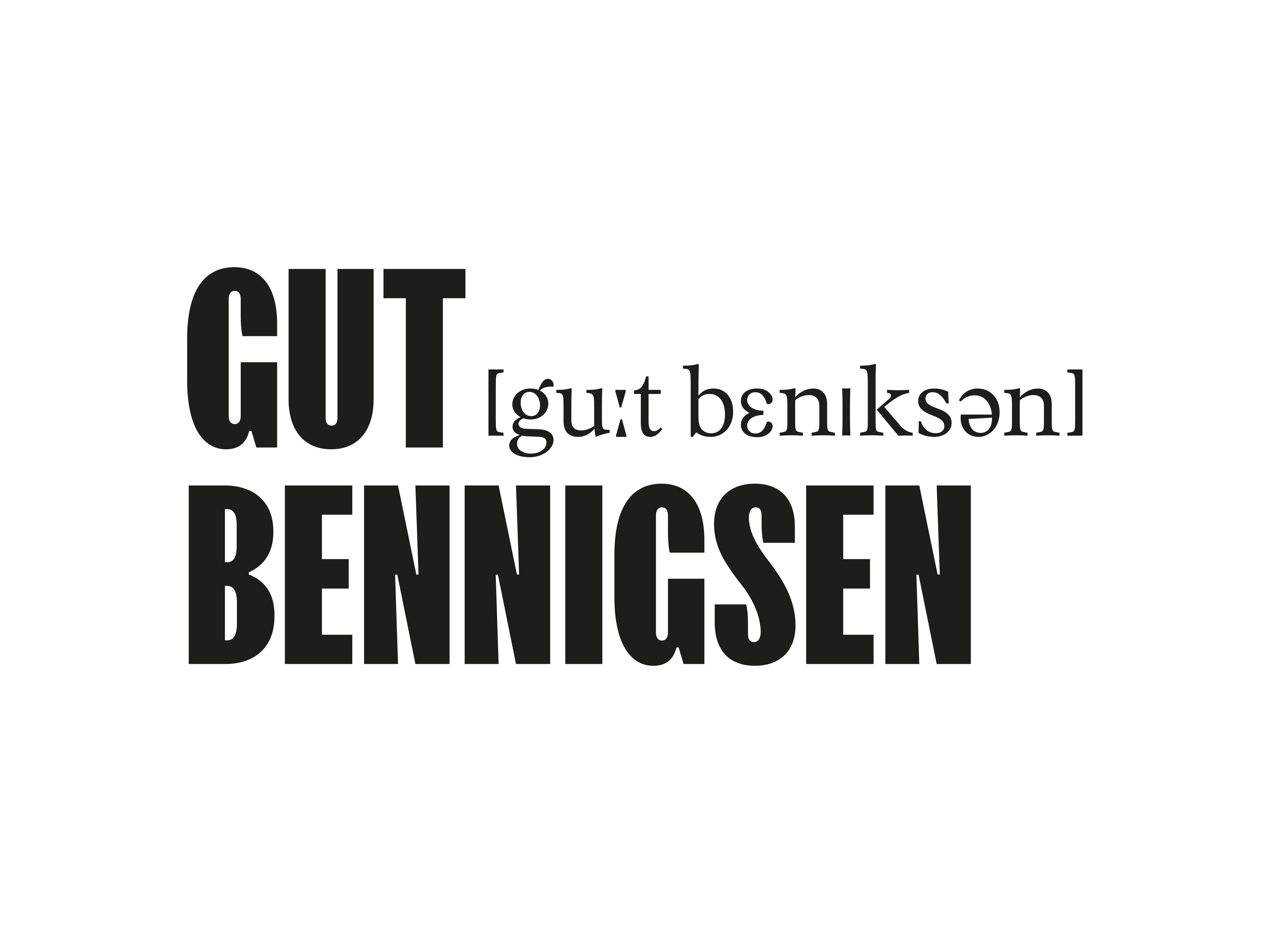
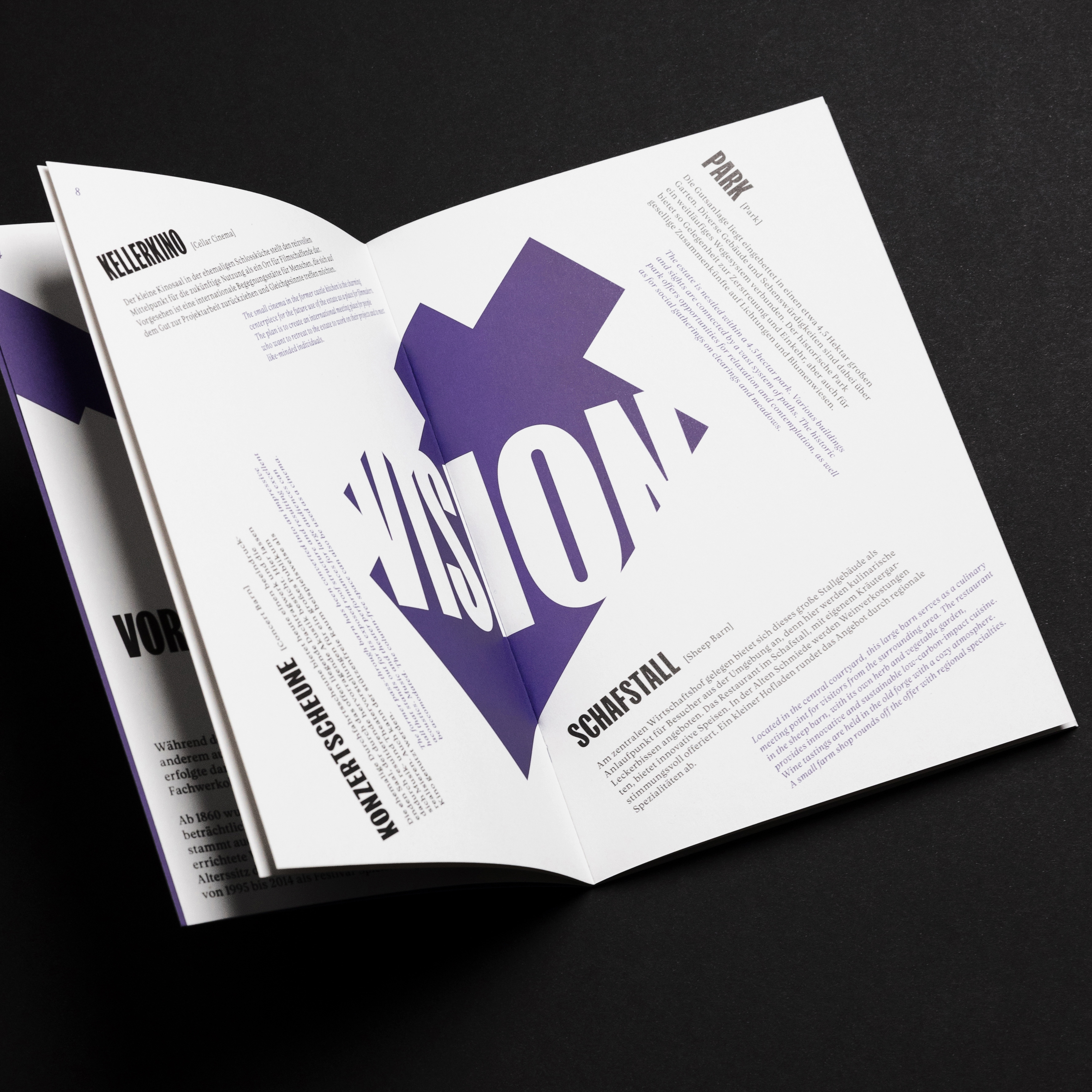
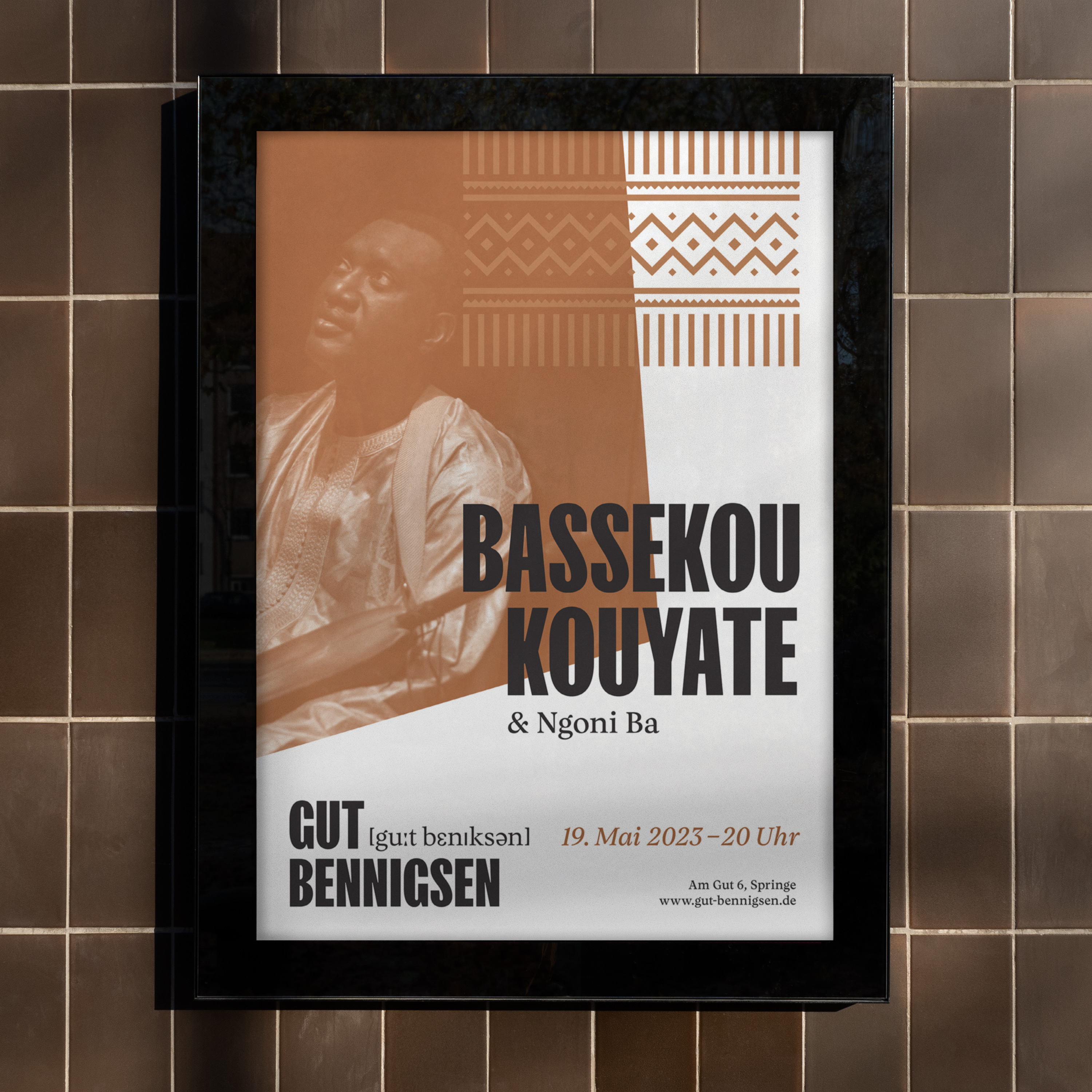
We developed a simple and bold modern look. The logo features phonetic spelling of Gut Bennigsen, which both explains the pronounciation in an international context and hints at the estate’s rich cultural tradition.
→ Success
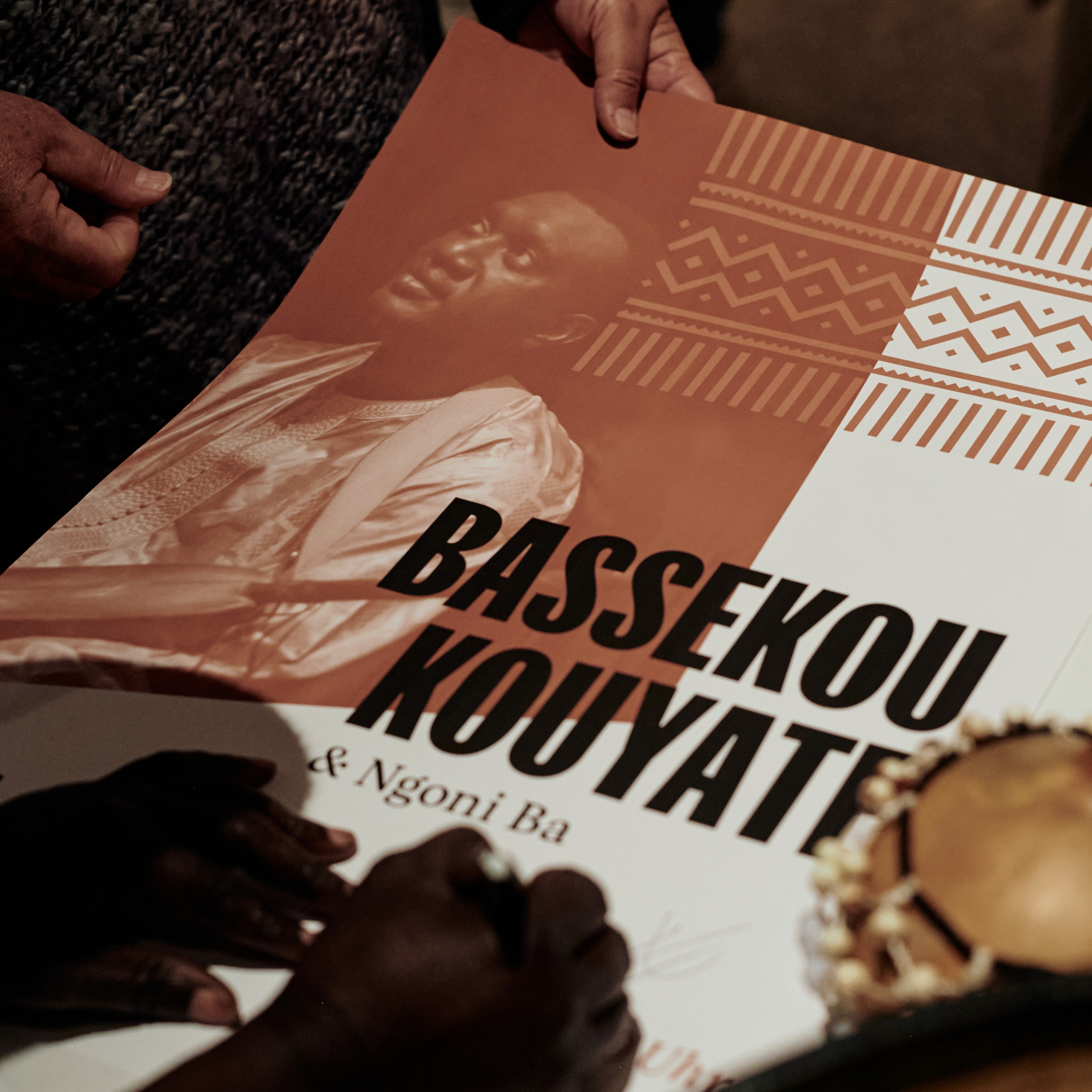
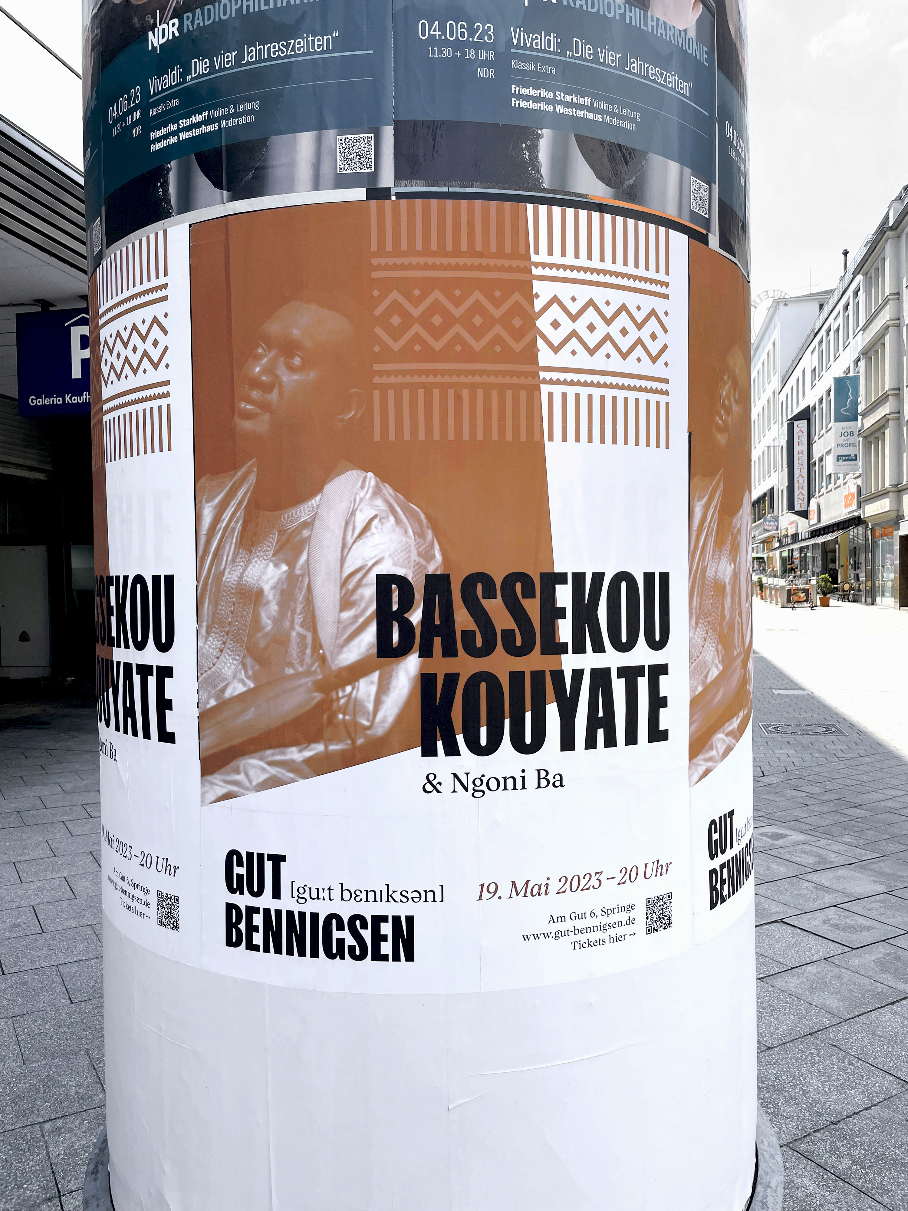
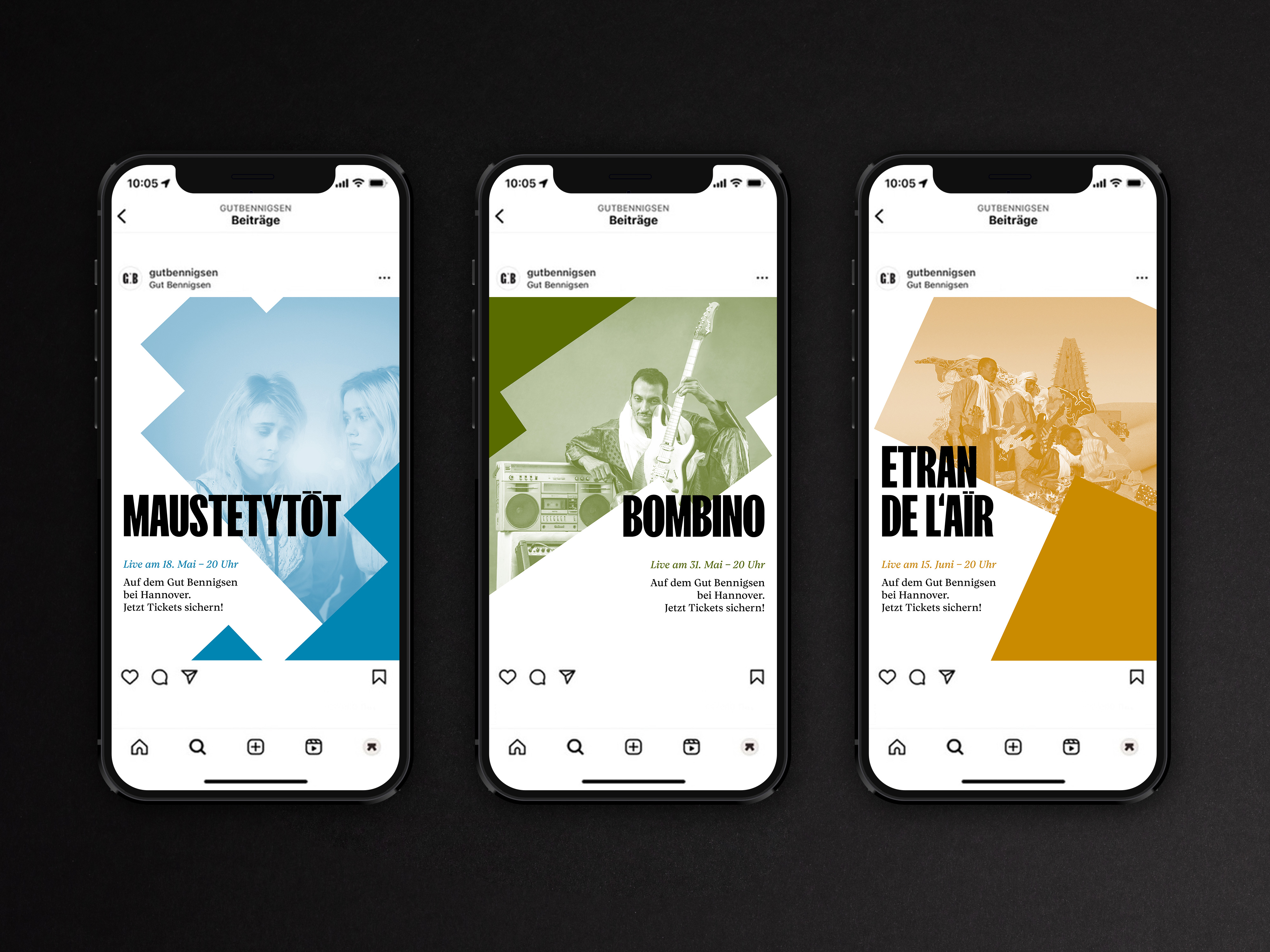
Highly successful in its first year Gut Bennigsen organised multiple events and concerts. Our marketing campaigns raised a local interest and drew lots of visitors to the estate grounds. Social media coverage and promotion enables an ever growing audience and creates a loyal following.
While most of their work happens digitally
they meet people in real life – acquiring
new clients in physical meetings or on set
filming the content.
Business cards express their own identity
and leave a lasting impression.
The shapes from the logo make up a
lively pattern that can be used in
printed material like this notepad…
On set the Picpacker team is wearing
branded apparel to let people know
what their up to.

Picpacker’s logo is made up by different combinations of geometric shapes. The flexibility of the mark highlights the versatile mode of practice the studio embodies.
… and is a great tool box for Picpacker
to use in their animations.

On set the Picpacker team is wearing
branded apparel to let people know
what their up to.
On set the Picpacker team is wearing
branded apparel to let people know
what their up to.
Suggesting movement the geometrical
patterns create a colorful vibrant setting
for Picpacker’s striking imagery.
On set the Picpacker team is wearing
branded apparel to let people know
what their up to.

On set the Picpacker team is wearing
branded apparel to let people know
what their up to.
Suggesting movement the geometrical
patterns create a colorful vibrant setting
for Picpacker’s striking imagery.
“Brimming with enthusiasm, originality and great ideas, I’d unhesitatingly and wholeheartedly recommend Transatlantika to anyone wanting to turn their business design ideas into reality!”
Immanuel von Bennigsen
Owner, Gut Bennigsen
What we did:
- Brand Identity
- Campaigns
- Color Palette
- Copywriting
- Illustration
- Logo Design
- Marketing
- Naming
- Positioning
- Printed Goods
- Strategy
- Typography
- Web Design
- Web Developing
→ Project Info
Picpacker Motion Design – Brand Identity
Created in 2024
Client: Picpacker Motion Design
→ Transatlantika Team
Creative Direction & Design: Philipp Zurmöhle
Project Management: Johannes Bösser
Stationery Photography: Robin Tielker
→ View Project on