Joining the fight against climate change.
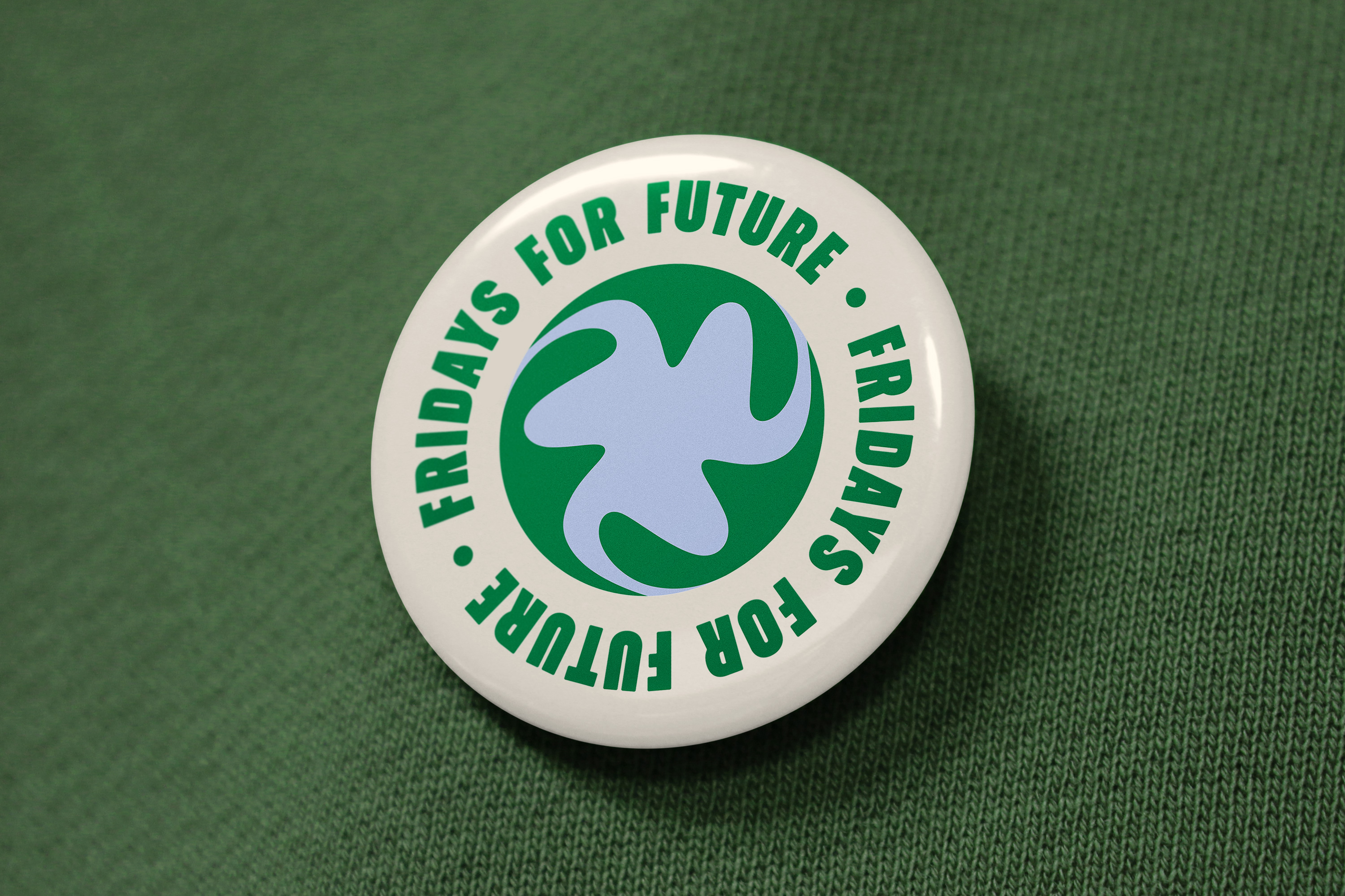
Fridays for Future
Identity Proposal
Fridays for Future is a climate strike initiative led and organised by youth. Started by Greta Thunberg in 2018, it is now an influential worldwide movement.
Youth come together to protest and demand action from political leaders. Preventing climate change and calling for the fossil fuel industry to transition to renewable energy is their main goal.
Transatlantika is proactively proposing an alternative logo and visual identity to their existing design elements.
As of now Fridays for Future is using an intricate handdrawn illustration of planet earth as their logo. Transatlantika’s newly proposed design aims for a more distinguishing approach that lets the movement be recognised easily.
Setting out to design a new logo for Fridays for Future, Transatlantika’s objective was to create a positive symbol that is unique, easy to read and carries a lot of meaning.
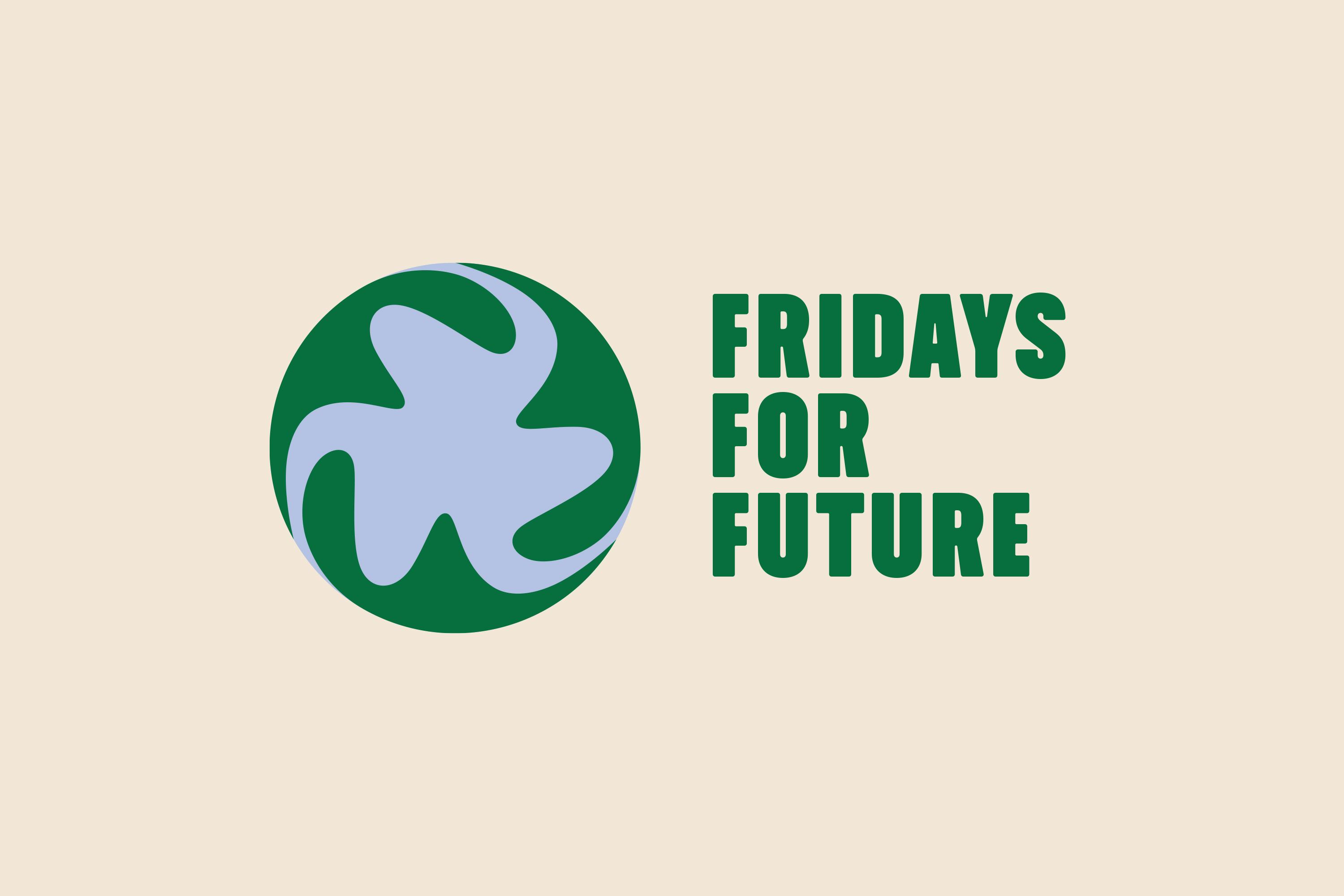
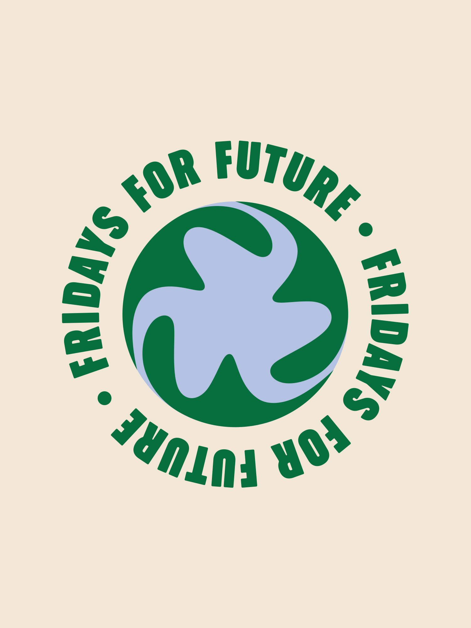
The result is an abstract depiction of planet earth with three swirling “f” letters. →
→ Briefing
Picpacker Motion Design needed to renew their brand identity. Their old one felt dated and wasn’t representing their company philosophy well enough any more.
→ Process
In personal meetings and video calls we discussed different directions. We presented three possible design directions. One of them was chosen and we improved it to fit them well.
→ Solution
We designed a visual system of geometric shapes to represent their versatility. The shapes are used in their animations and representative printed stationery.
→ Success
Their clients approved of the new identity right away. After a few months in use Pickpacker remains confident about their new look and uses the geometric shapes in their animations.
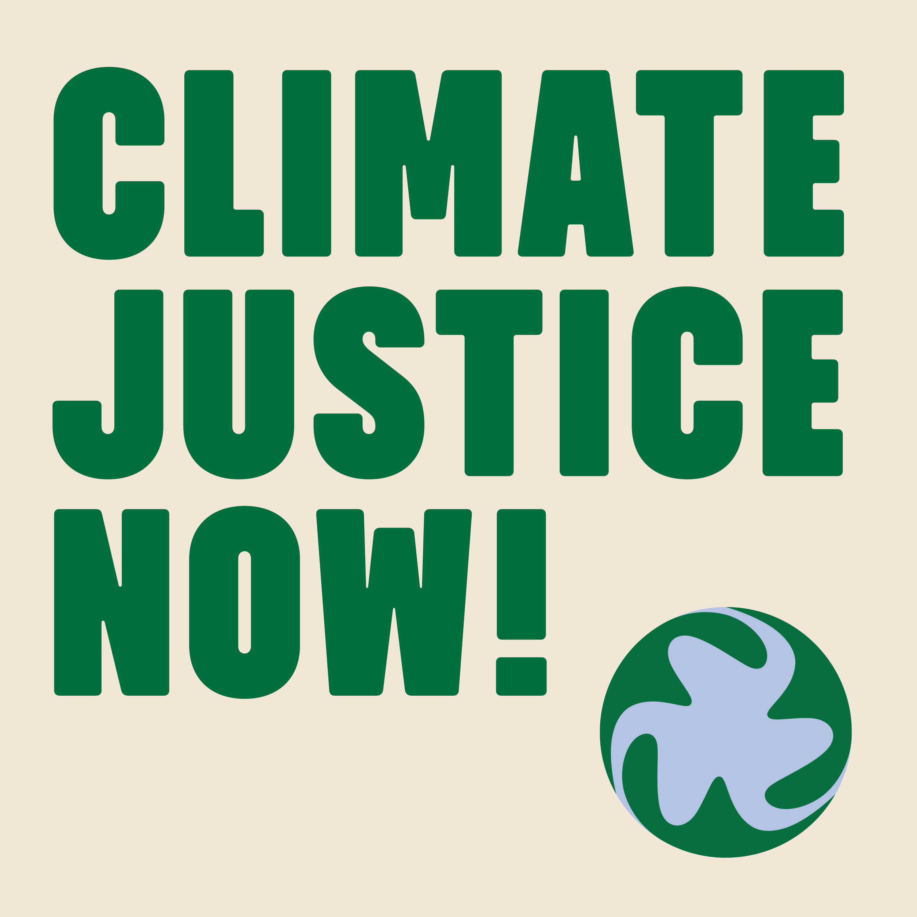
← Using the bold typeface Midnight Sans by Colophon, messages can be communicated with a sense of urgency.
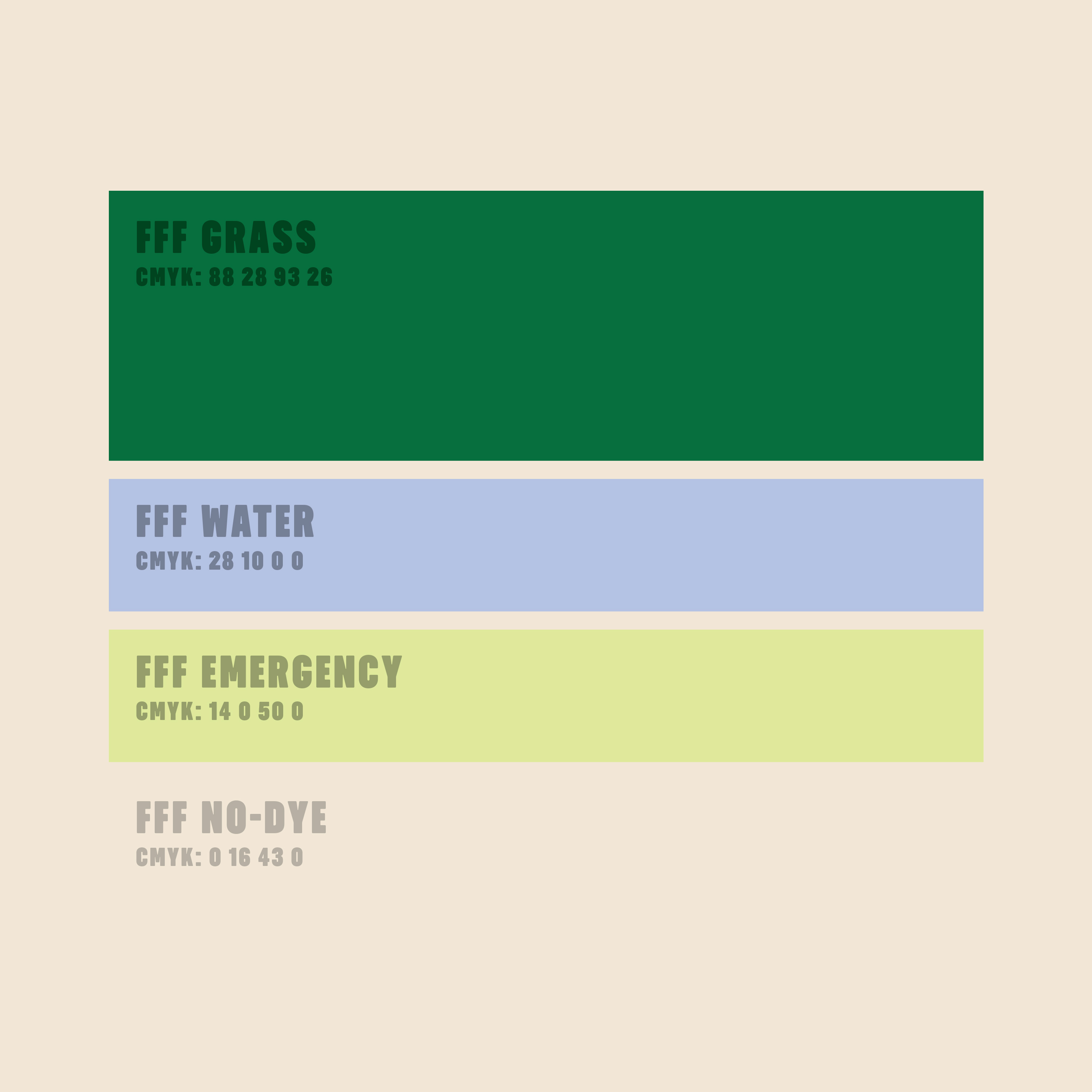
The color palette features hues that are known to be utilized in an environmentally friendly context. The background color references the “no-dye” technique for garments, avoiding ink and water.
The symbol can be repainted by protesters easily.
Obviously depicting the earth iconography, which is prevalent at every climate protest, it works as a characteristic identifier for Fridays for Future. →
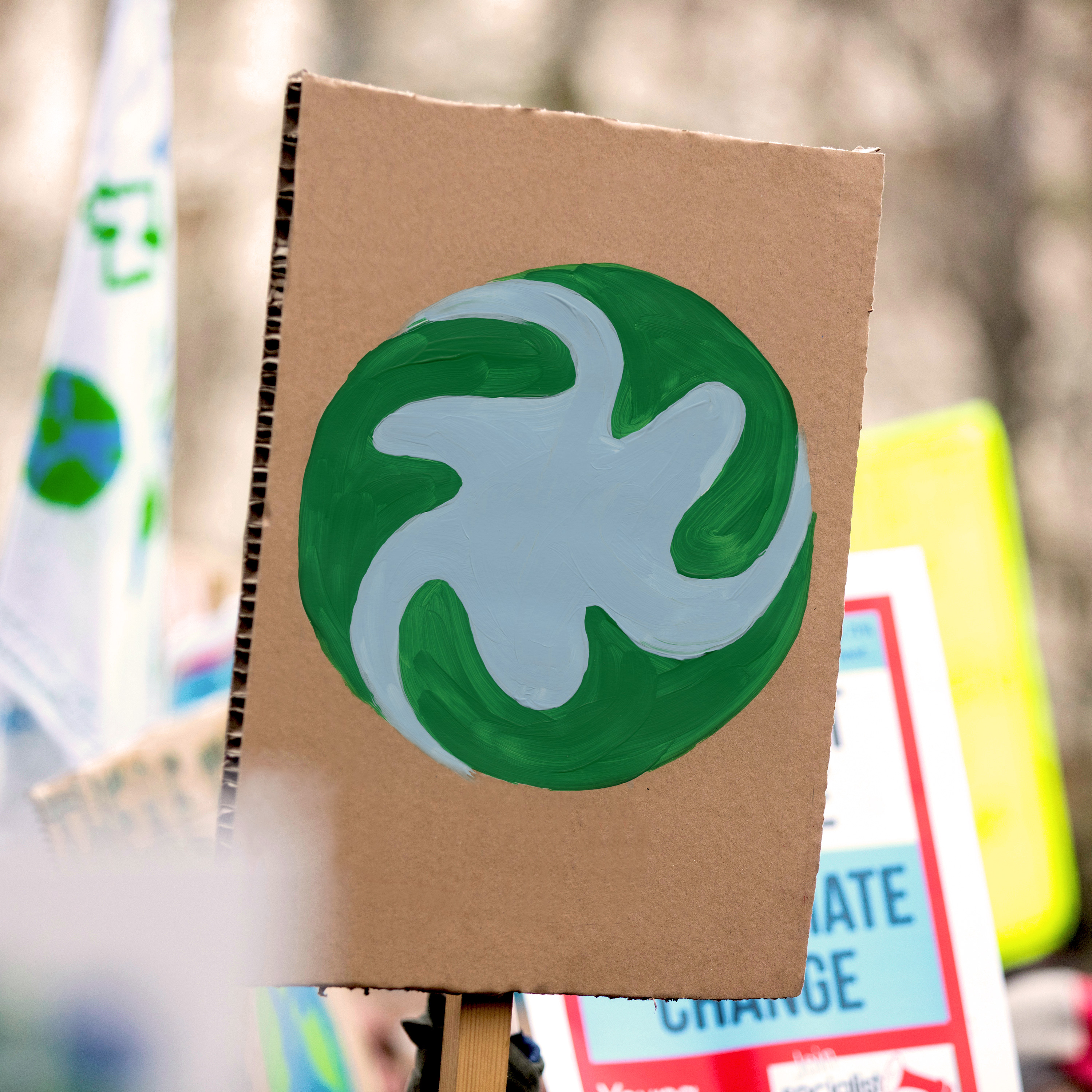
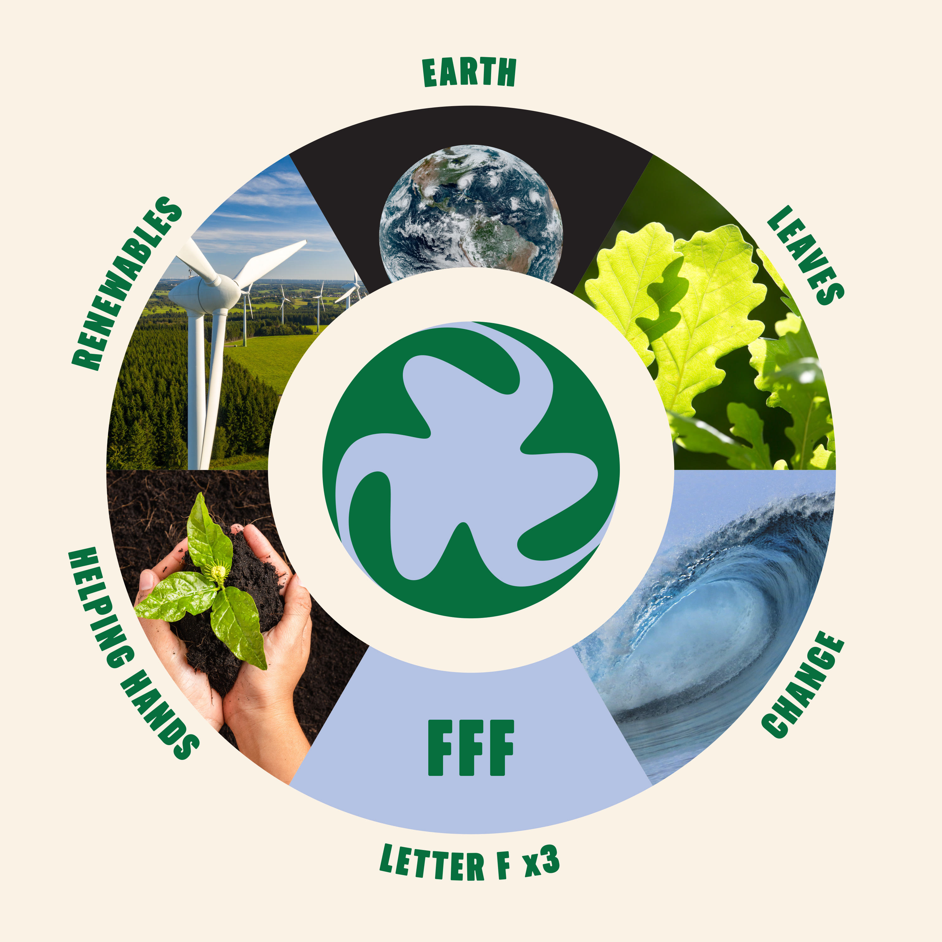
The logo contains a wide range of symbolism. Apart from the obvious depiction of our planet, it includes three f’s and generally conveys a sense of change.
The shapes are also reminiscent of leaves, waves, helping hands and wind turbines. →
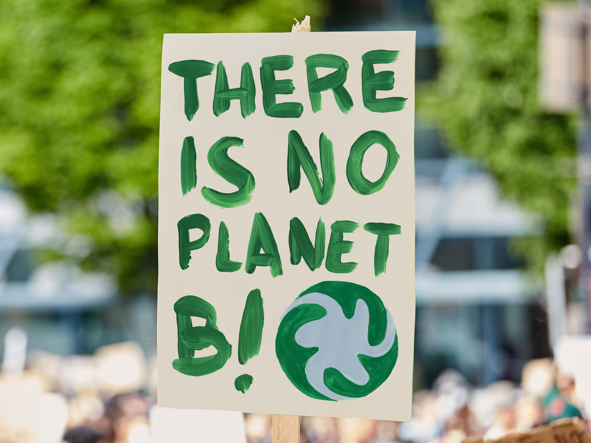
← The symbol goes together well with slogans and works as a characteristic sign-off for Fridays for Future.
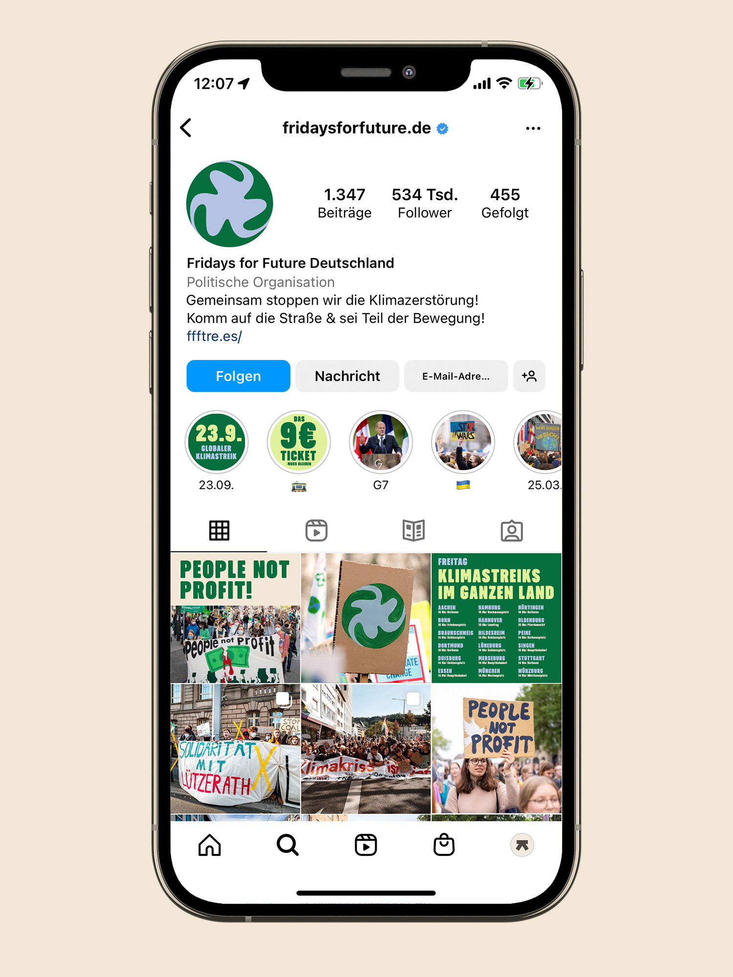
Fridays for Future’s social media channels have the chance to appeal to people with a stronger identity and headlines can have a bigger impact. →
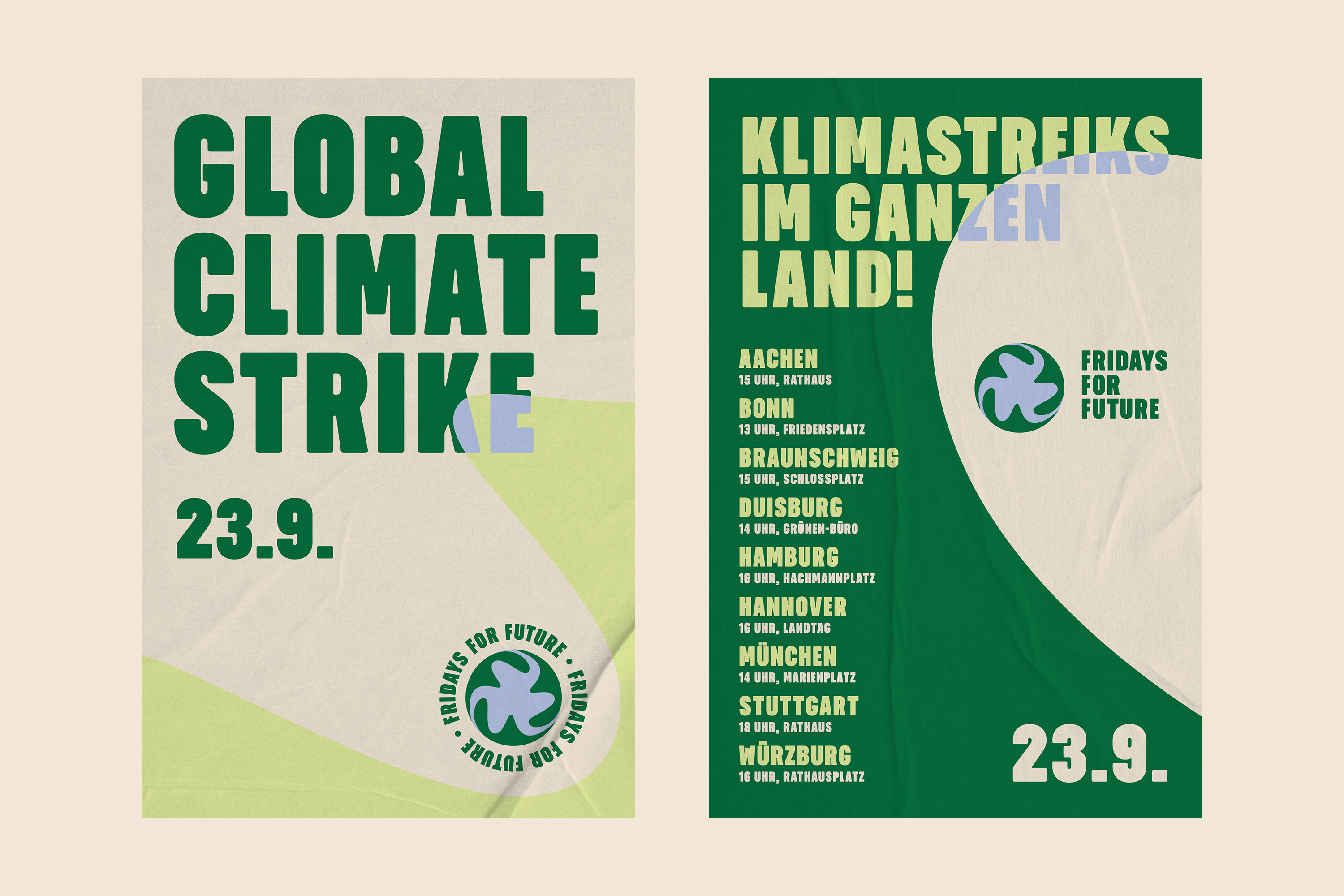
The logo shapes can be used to make layouts more exciting while at the same time hinting at the flooding caused by climate change.
These are some poster design examples.
“Transatlantika’s perfect blend of profound consultation and creative implementation has impressed us greatly.”
Franz Sickinger
Managing Partner at Picpacker
What we did:
- Brand Identity
- Campaigns
- Color Palette
- Ideation
- Logo Design
- Typography
→ Project Info
Picpacker Motion Design – Brand Identity
Created in 2024
Client: Picpacker Motion Design
→ Transatlantika Team
Creative Direction & Design: Philipp Zurmöhle
Project Management: Johannes Bösser
Stationery Photography: Robin Tielker
→ View Project on