Busy scenes of origin leave an original impression.
Pure Tea
Packaging Illustrations
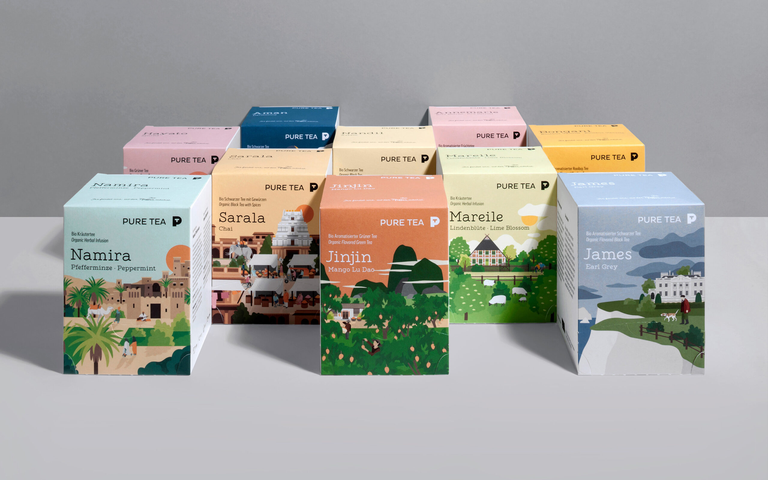
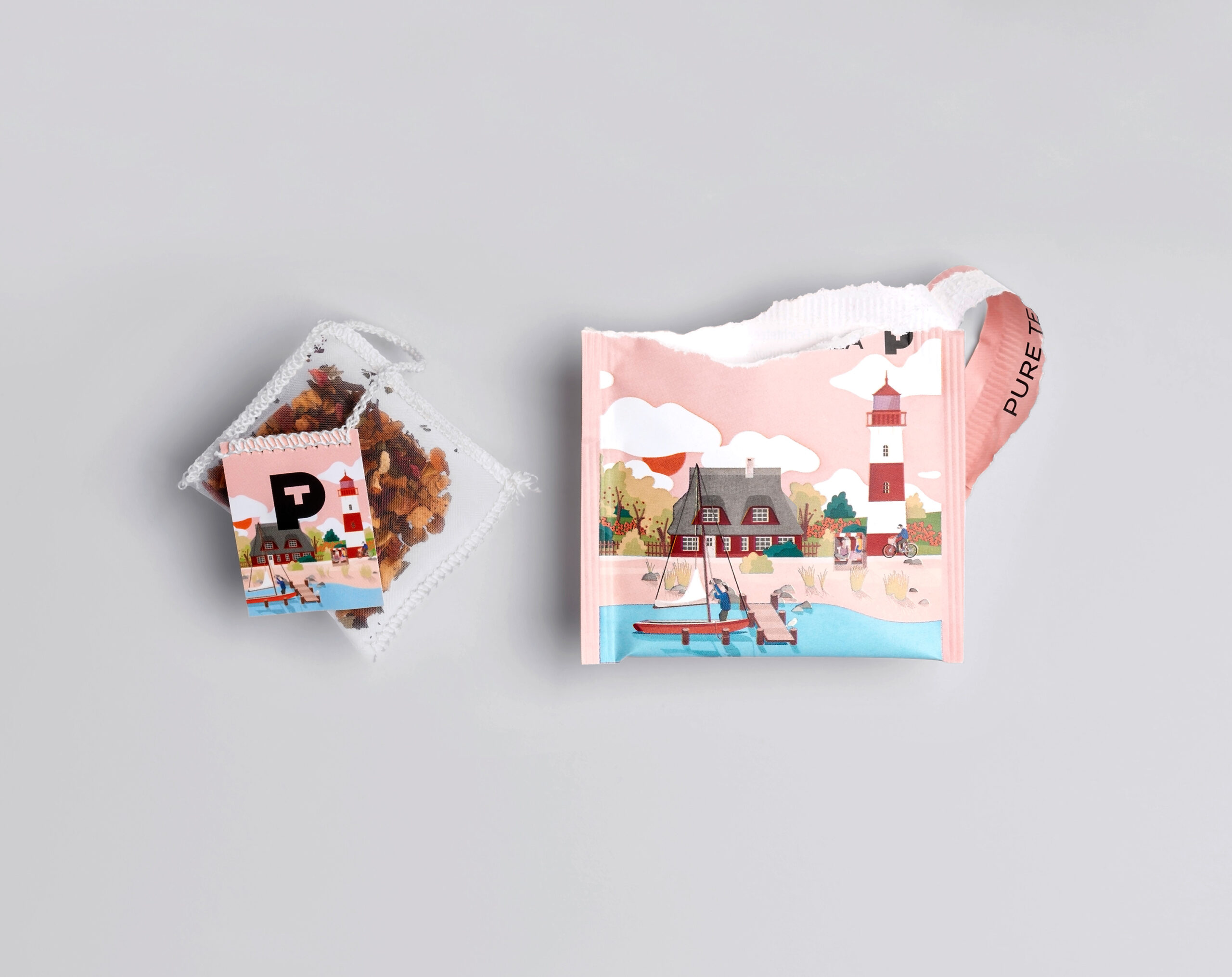
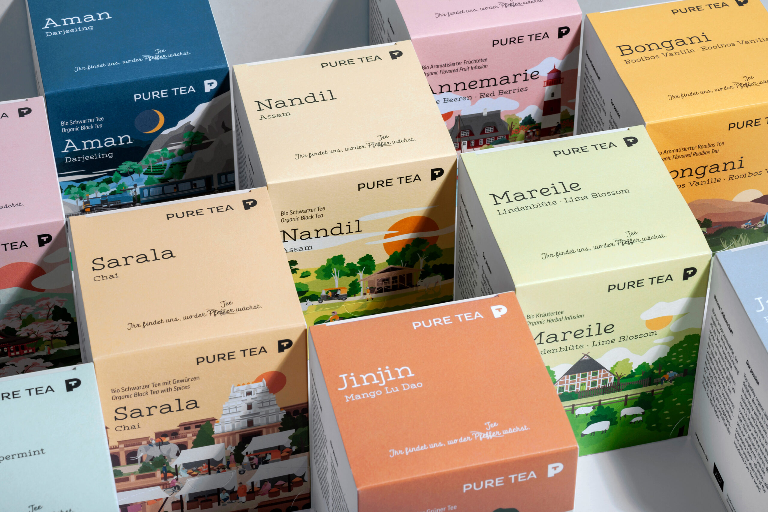
Illustrations for the packaging design of German organic tea brand Pure Tea. Detailed landscapes are depicted to show scenes from the teas’ countries of origin.
Launched in early 2019, the rebrand features 13 different flavour illustrations.
The design and illustrations won an iF Design Award, a Red Dot Design Award and a DDC Product Award.
The illustrations’ colours relate to the different tea flavours and regions’ cultural characteristics at the same time.
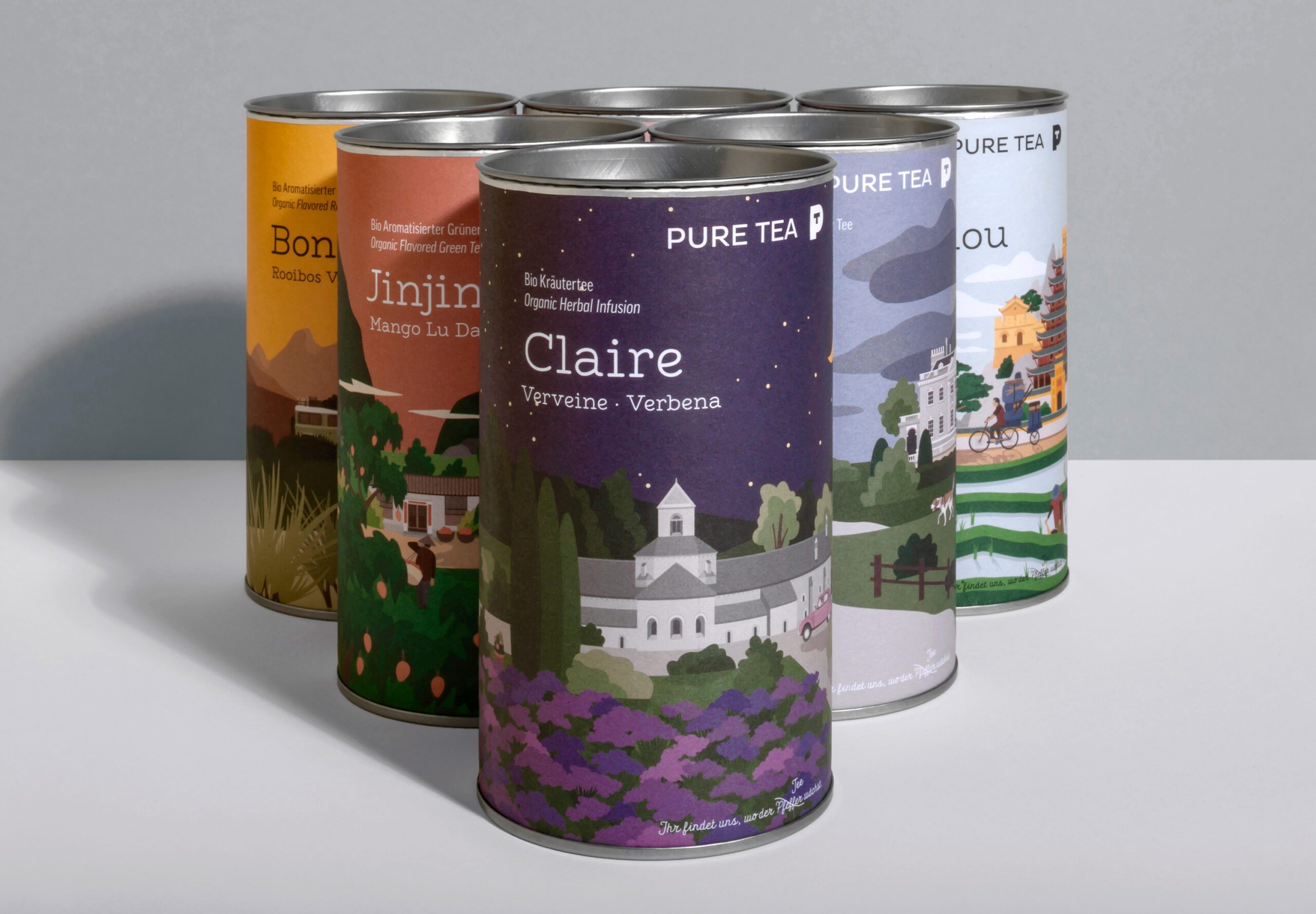
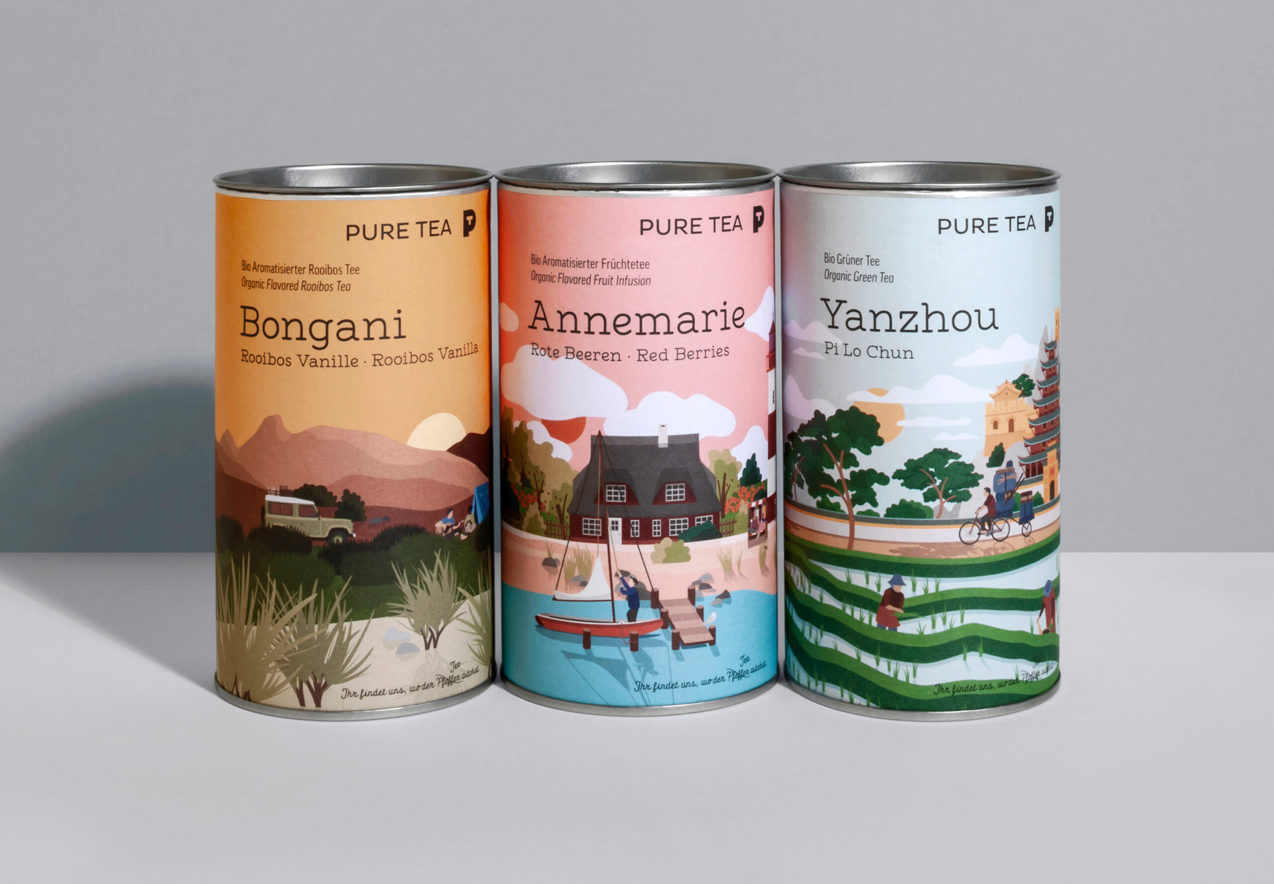
For the Pure Tea loose leaf teas the illustrations wrap around tin packaging.
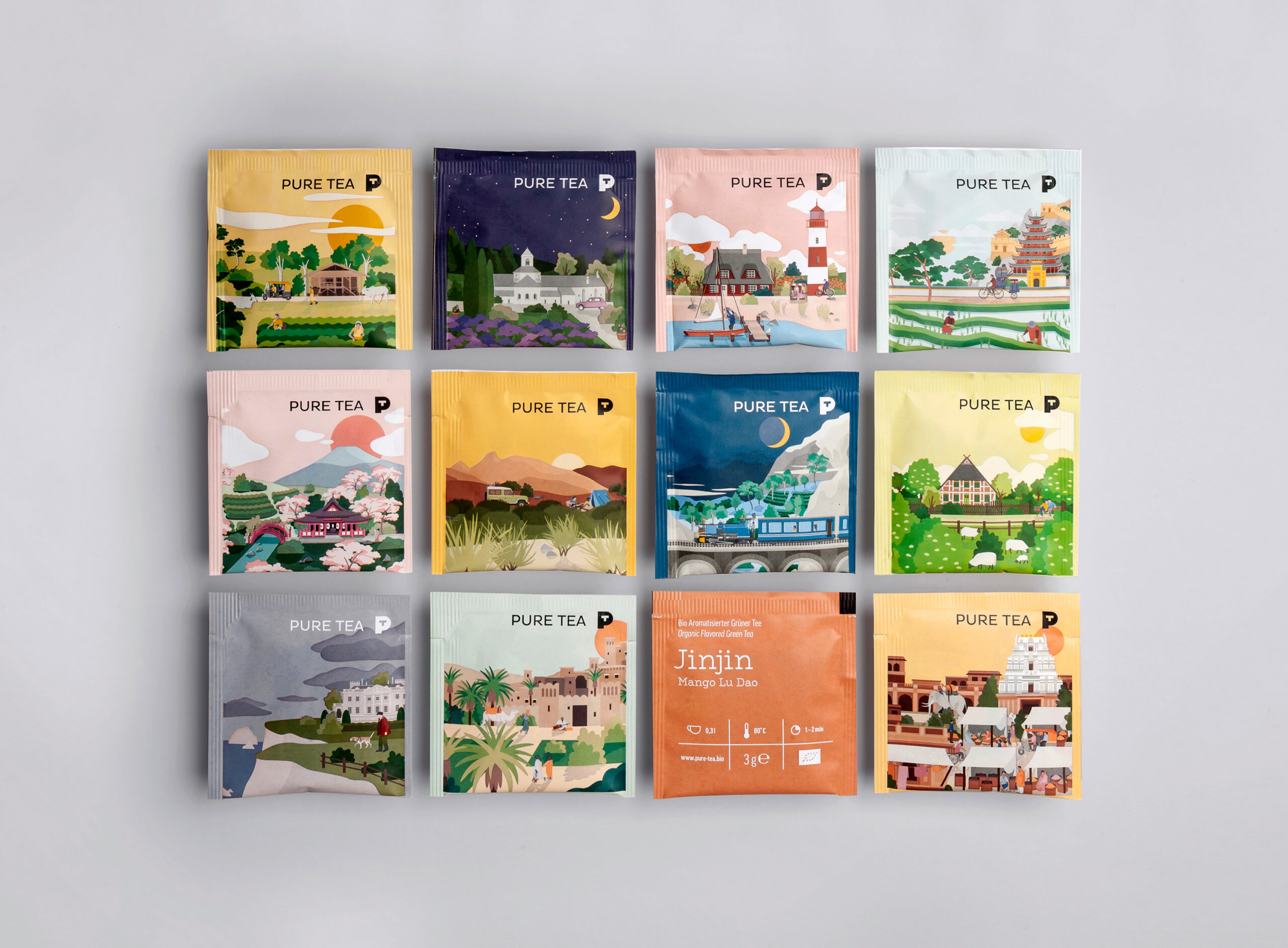
A bustling Indian spice market in front of a hindu temple is shown on the chai tea pack.





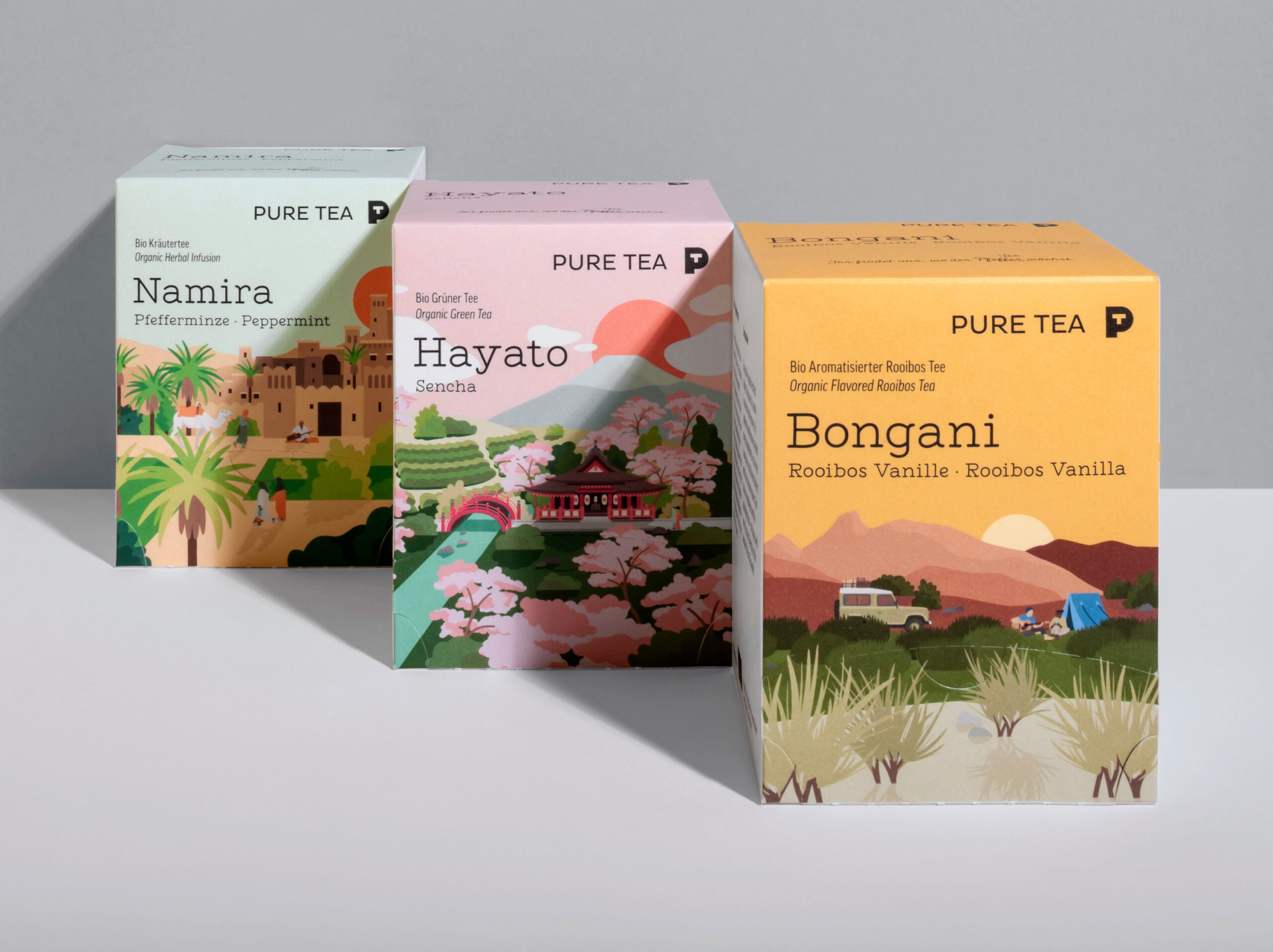
On the Sencha tea packaging a Japanese garden filled with cherry blossom trees is featured. There’s a shinto temple in it with Mount Fuji in the background.


The peppermint flavour illustrates a lush garden scene at the entry gates of an ancient Moroccan city.





A mountainous Chinese landscape with a plantation in the foreground is depicted on the Illustration for the mango flavour.
What we did:
- Illustration
- Packaging Design
→ Project Info
Pure Tea – Packaging Illustrations
Client: Pure Tea
→ Transatlantika Team
Illustration: Philipp Zurmöhle
Collaboration with Heine Warnecke Design – Dirk Heine (Creative Direction), Sina Feuerhake (Layout and Design)
Photo Credits: Heine Warnecke Design
→ View Project on