Europe’s market leader gets a timely mark.
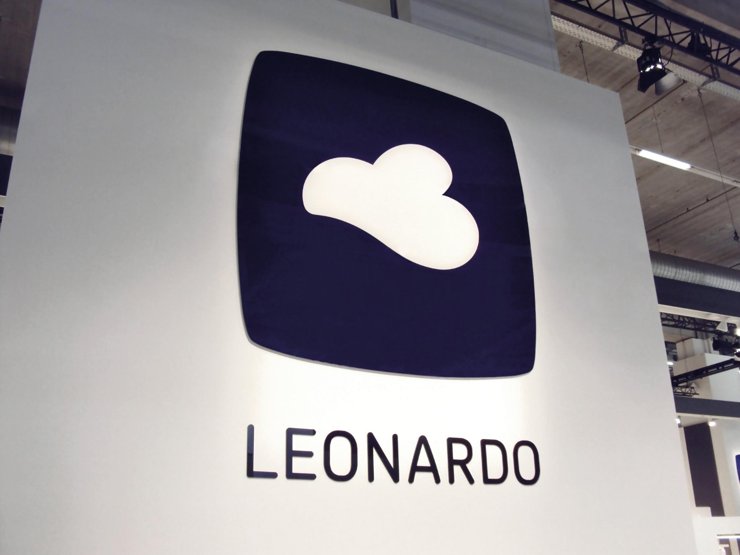
Leonardo Glassware
Logo Redesign
As one of Germany’s leading brands in gift items and glasses, Leonardo is one of the most popular glassware brands in Europe.
In cooperation with Leonardo we designed a new logo using their known cloud image to become an iconic symbol for dynamics, inspiration and lightness.
Relating to Leonardo’s brand value of „inspiration“ the symbol can be read in different ways. The obvious cloud can also be interpreted as a bird or a heart.
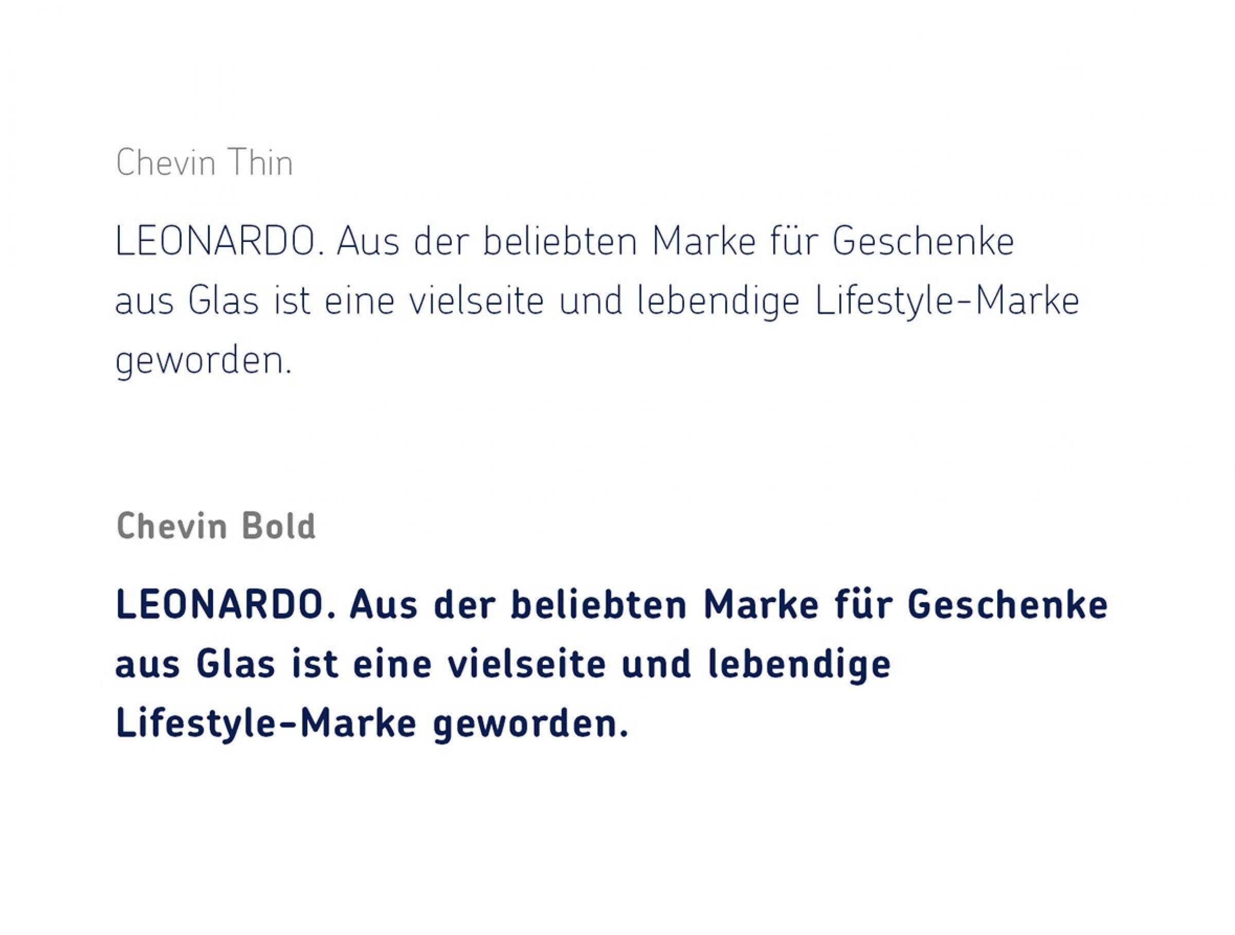
The brand identity utilizes the typeface Chevin. →
→ Briefing
Picpacker Motion Design needed to renew their brand identity. Their old one felt dated and wasn’t representing their company philosophy well enough any more.
→ Process
In personal meetings and video calls we discussed different directions. We presented three possible design directions. One of them was chosen and we improved it to fit them well.
→ Solution
We designed a visual system of geometric shapes to represent their versatility. The shapes are used in their animations and representative printed stationery.
→ Success
Their clients approved of the new identity right away. After a few months in use Pickpacker remains confident about their new look and uses the geometric shapes in their animations.
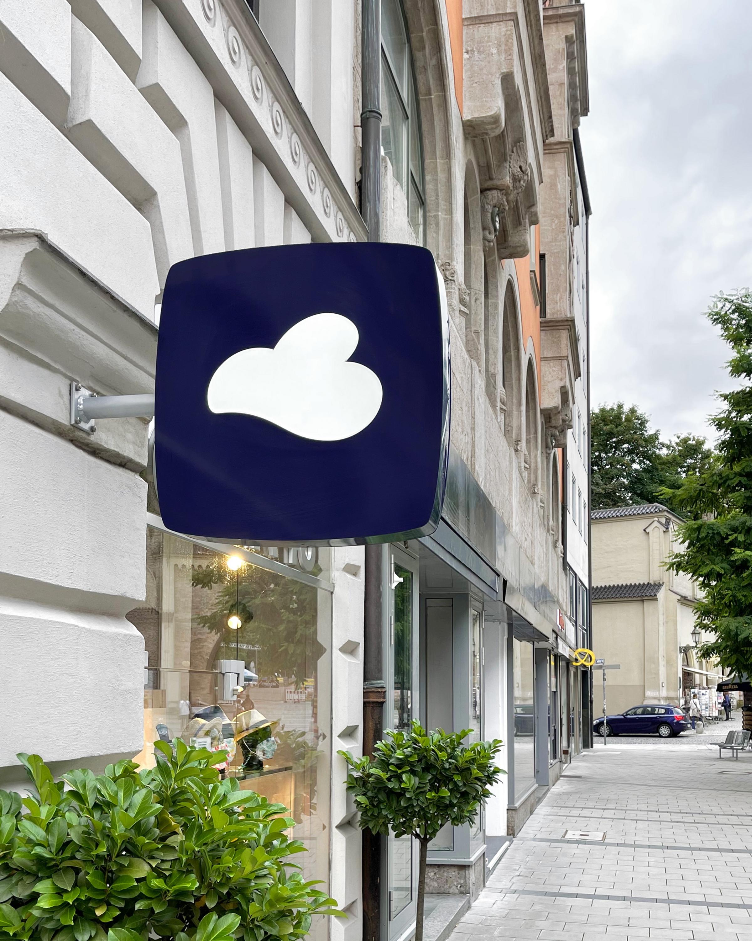
← For over 10 years now, the Logo is used throughout all of Leonardo‘s communication.
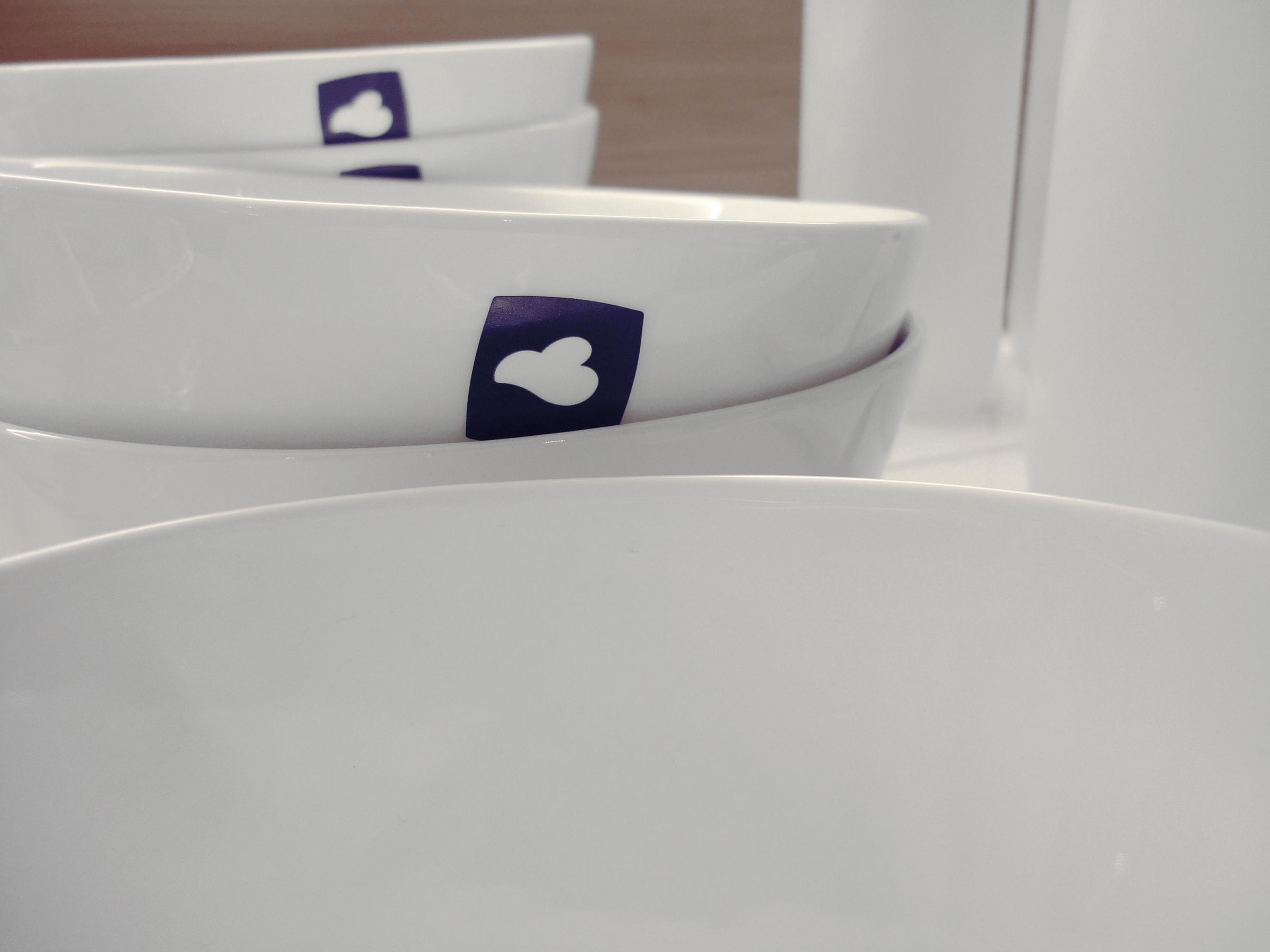
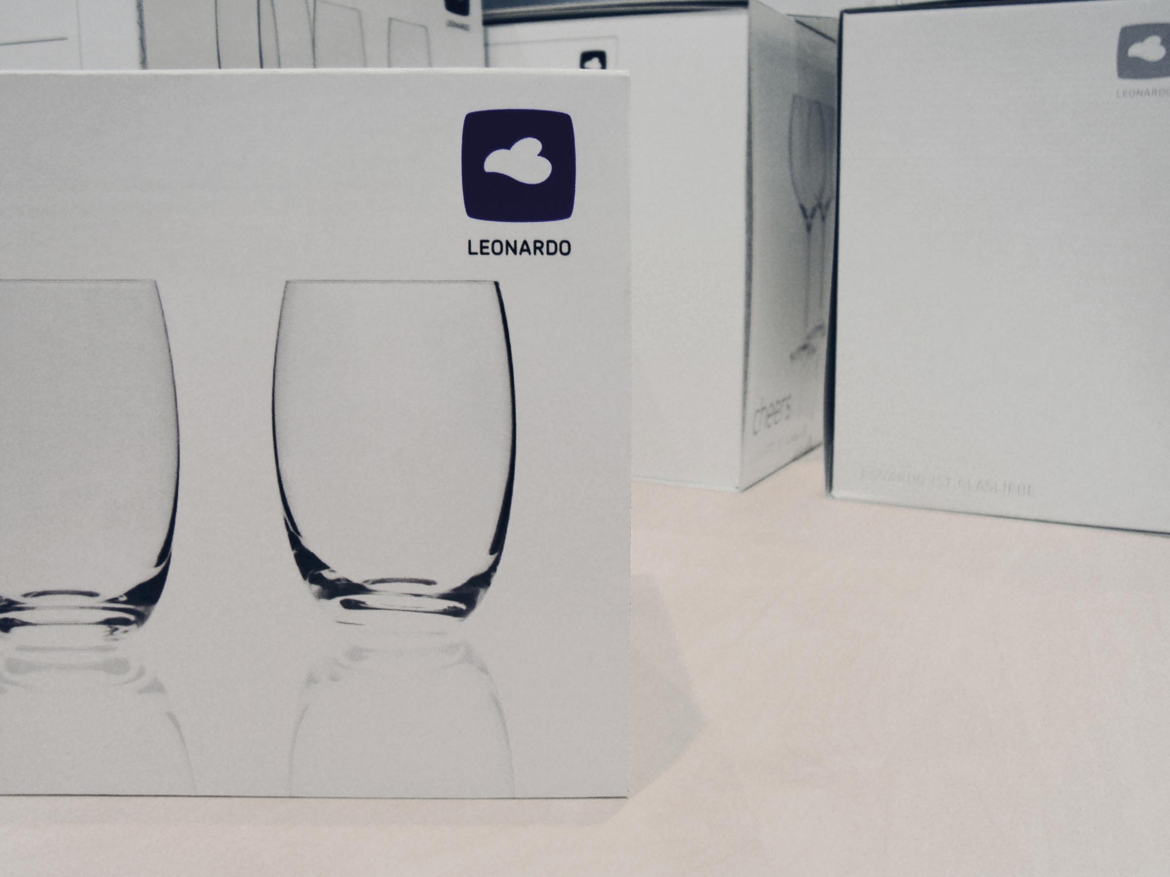
Logo use on Leonardo’s products and packaging.
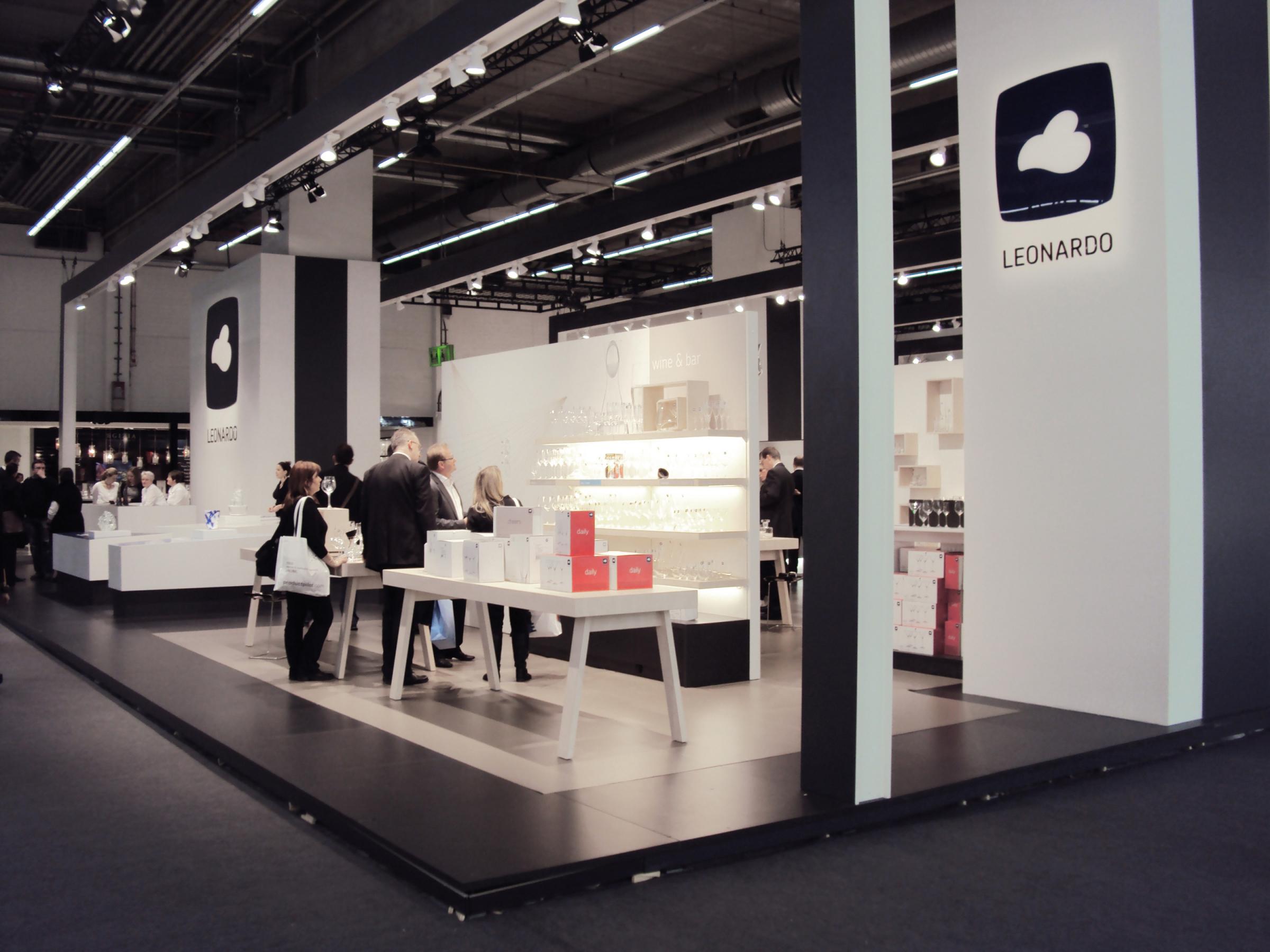
Brand identity application on their stand on the Ambiente fair in Frankfurt.
What we did:
- Brand Identity
- Logo Design
→ Project Info
Leonardo Glassware – Logo Redesign
Created in 2009
Client: glaskoch B. Koch jr. GmbH
→ Transatlantika Team
Creative Direction & Design: Philipp Zurmöhle
→ View Project on