Herr Menig Optik – Illustrations
A flexible identity for creatives on the move.
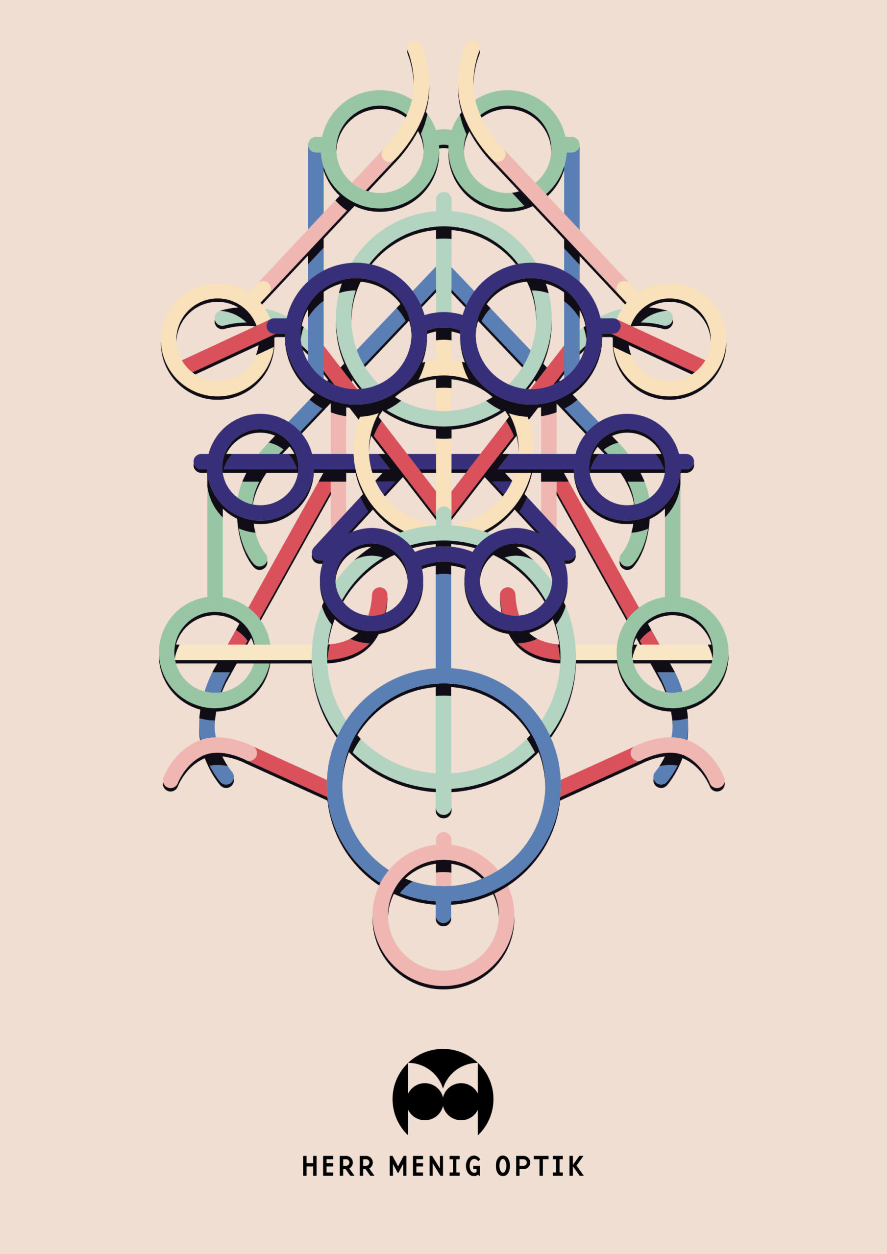
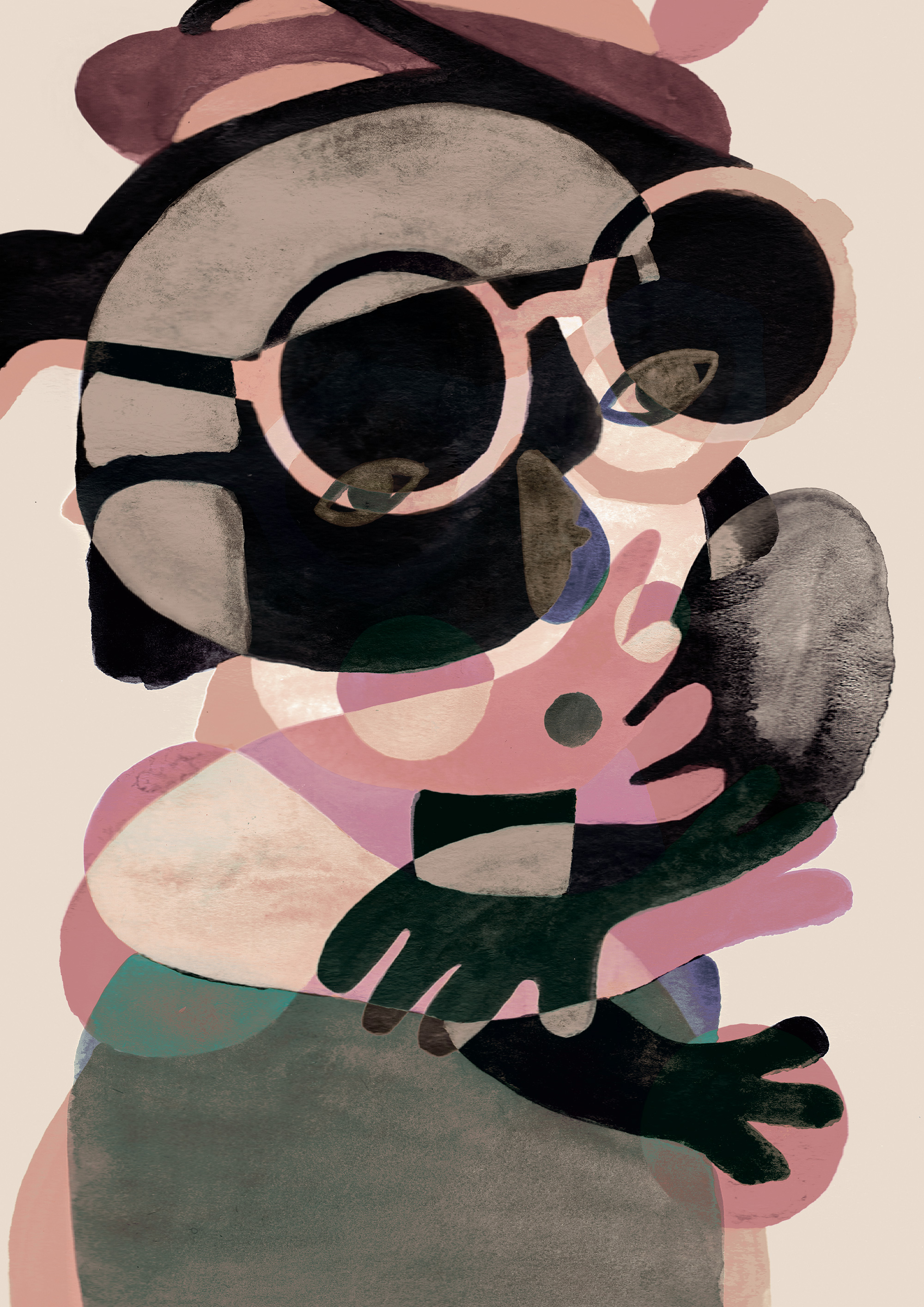
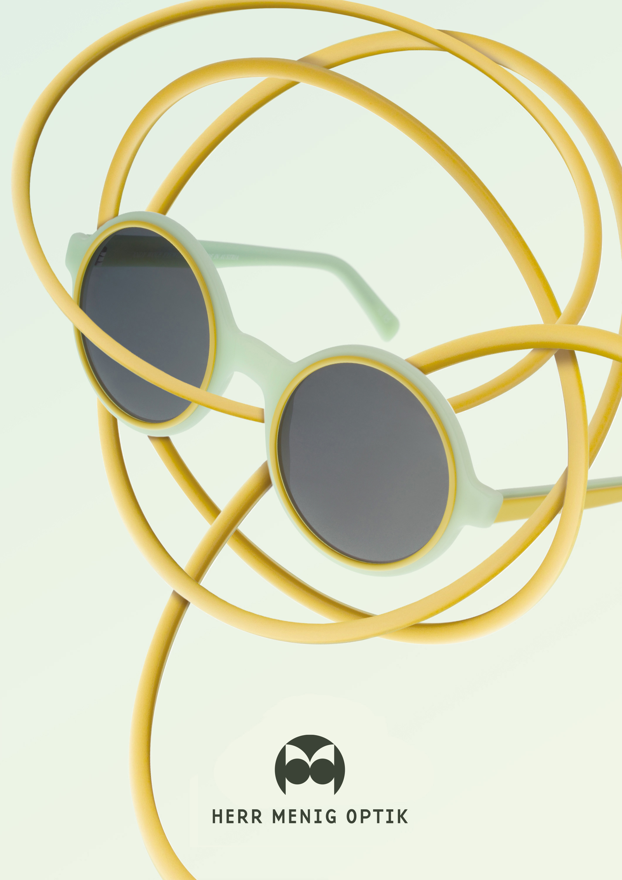
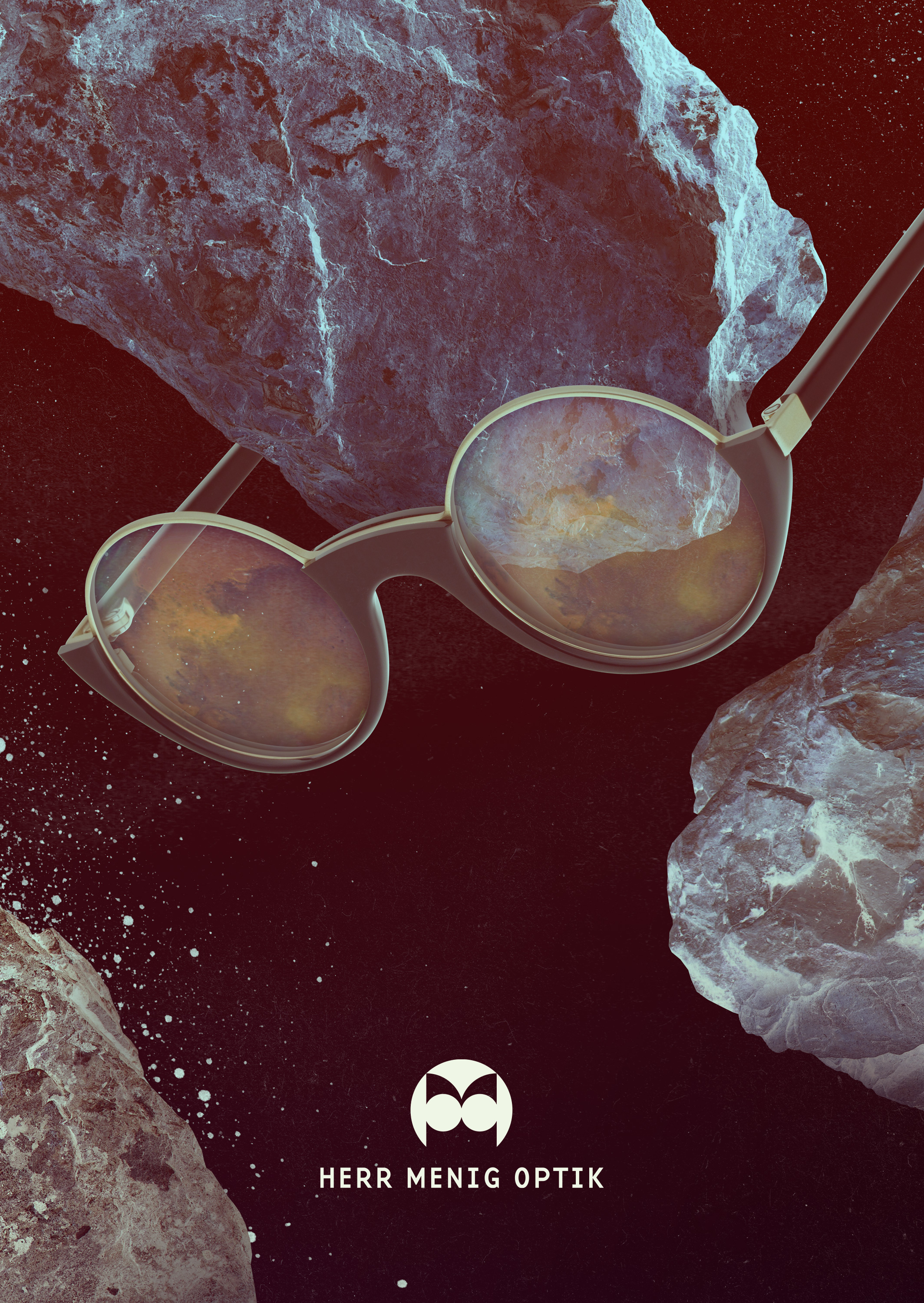
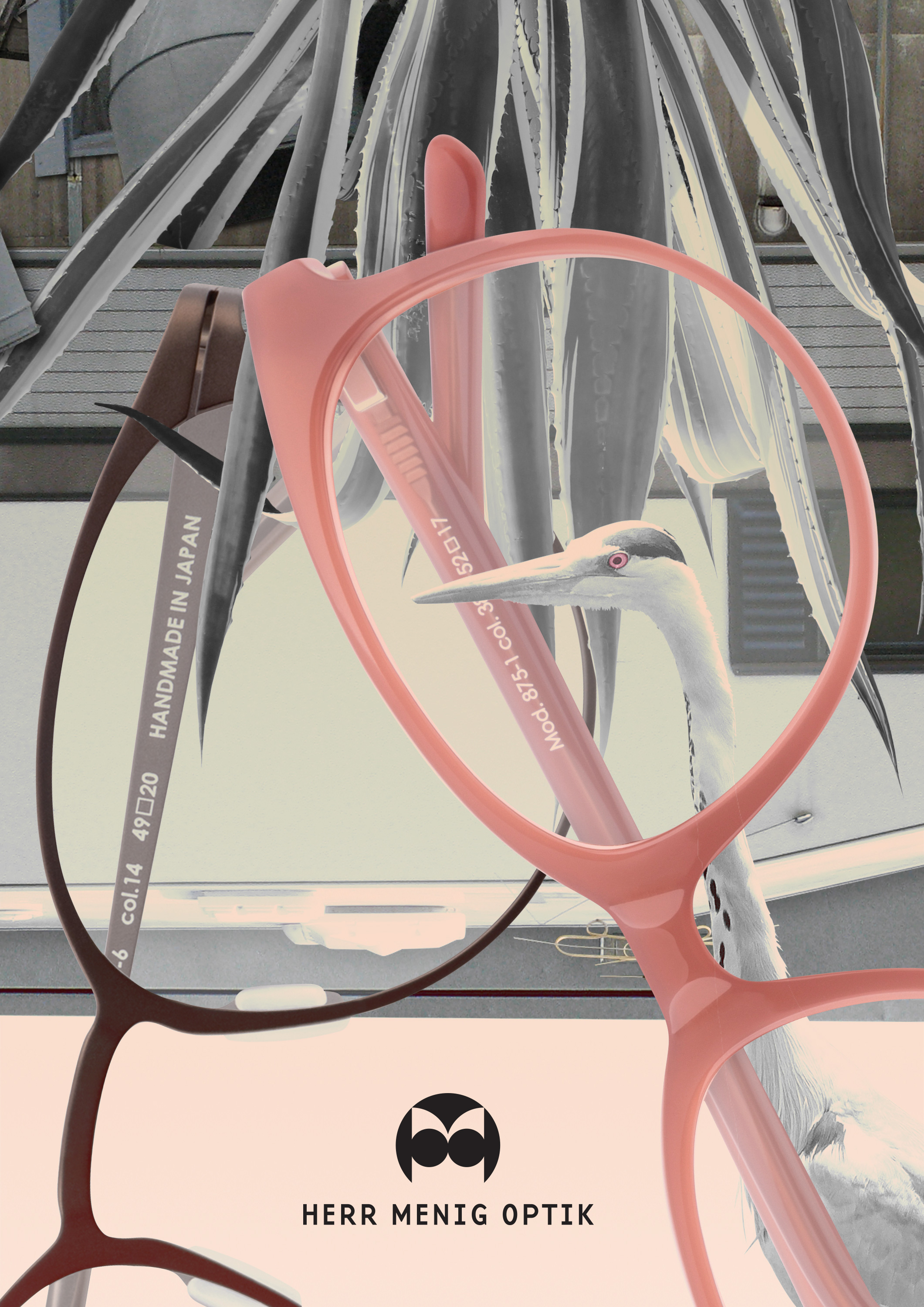
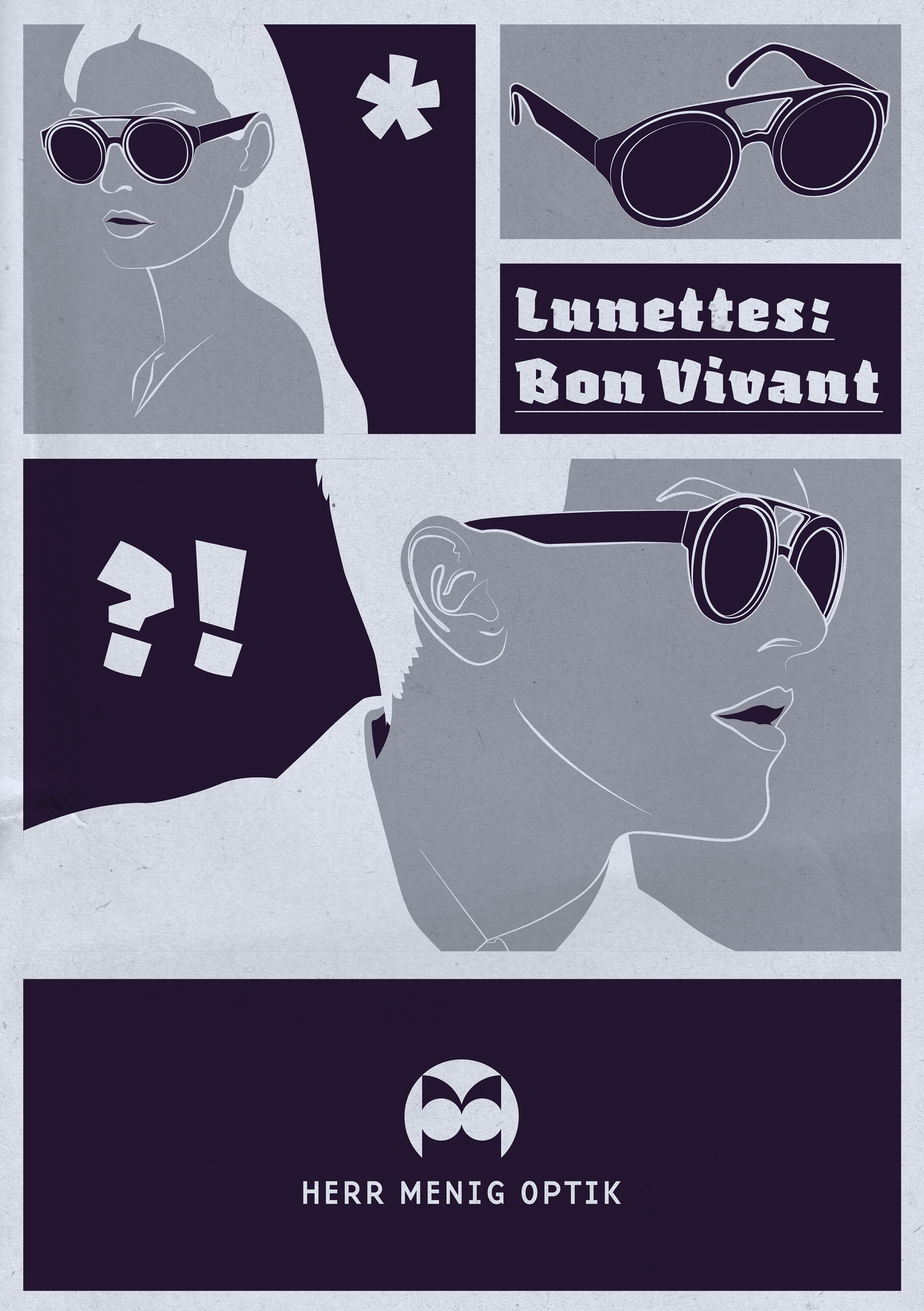
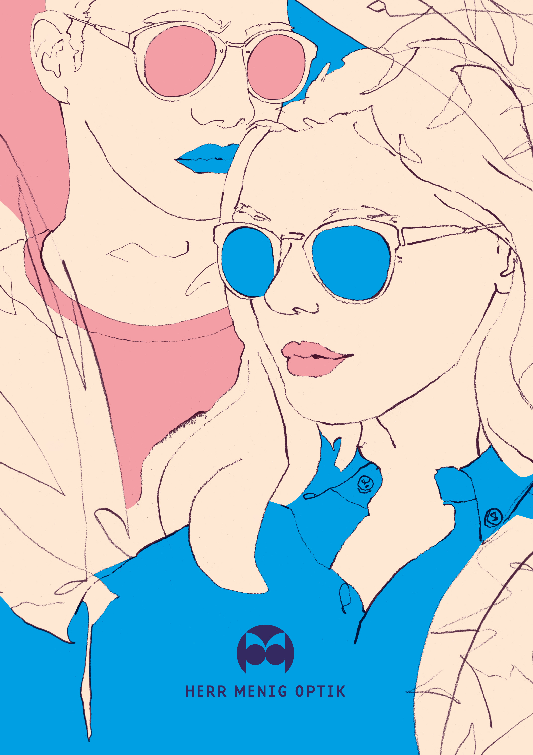
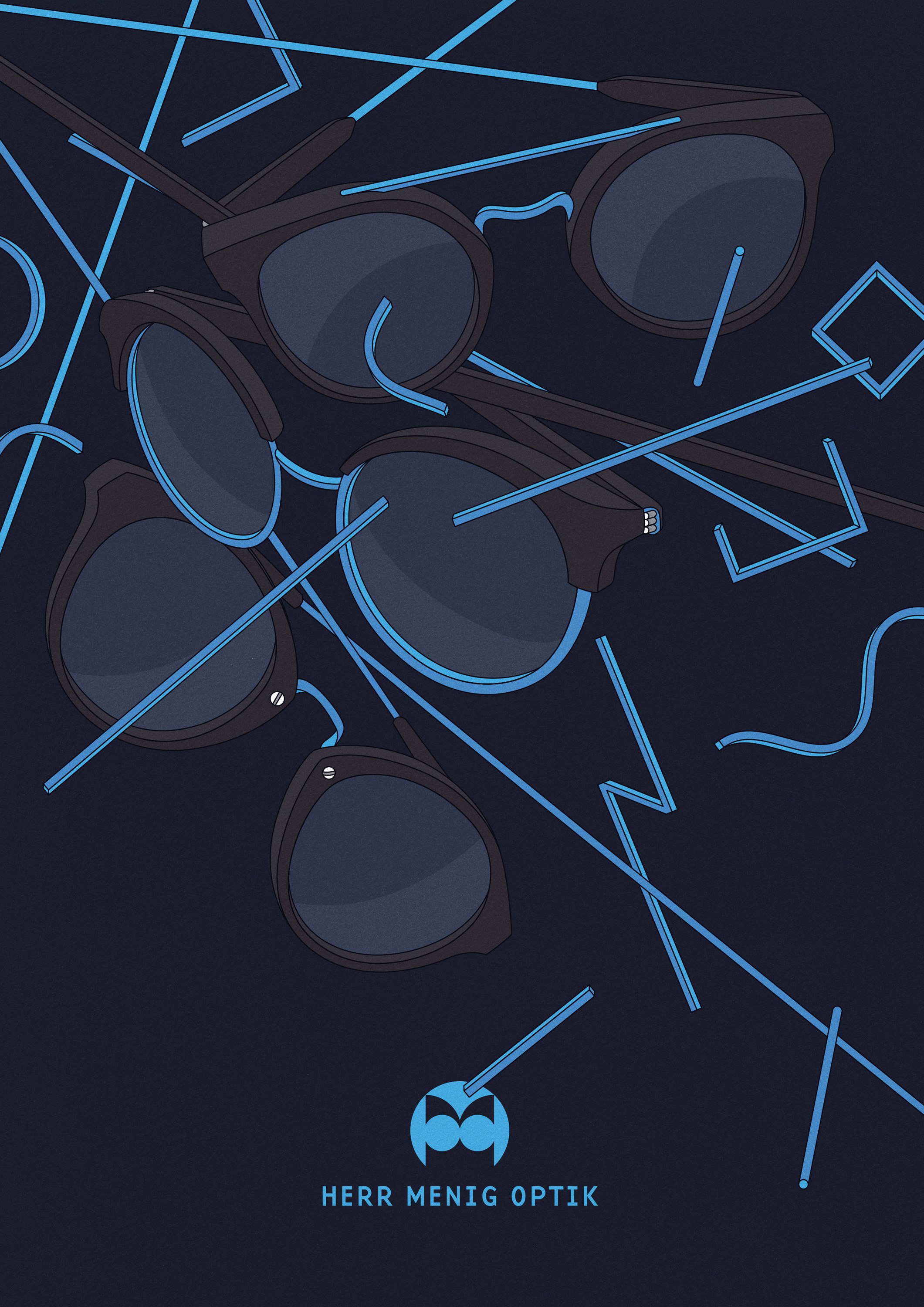
Ad and postcard illustrations for the local optician Herr Menig Optik in Nürnberg, Germany.
The approach to the advertising concept is experimenting visually. Every month there’s a different style for the motives, which highlight Herr Menig Optik’s unusual selection of glasses.
→ Briefing
TBD
→ Process
TBD
→ Solution
TBD
→ Success
TBD




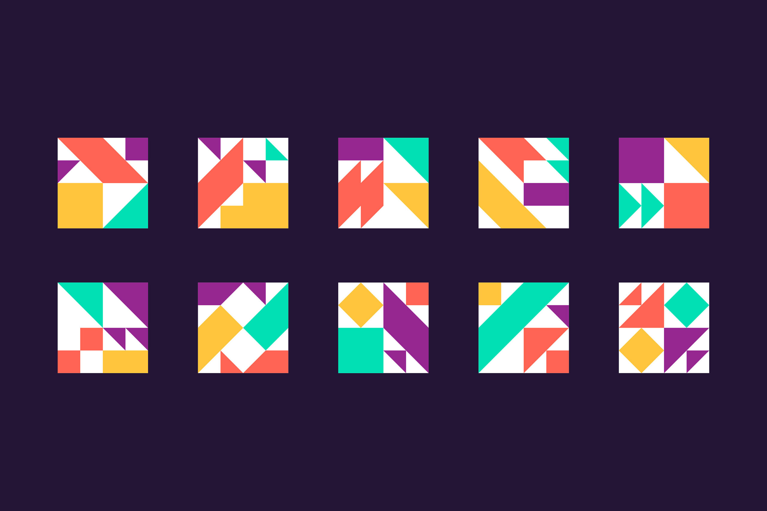
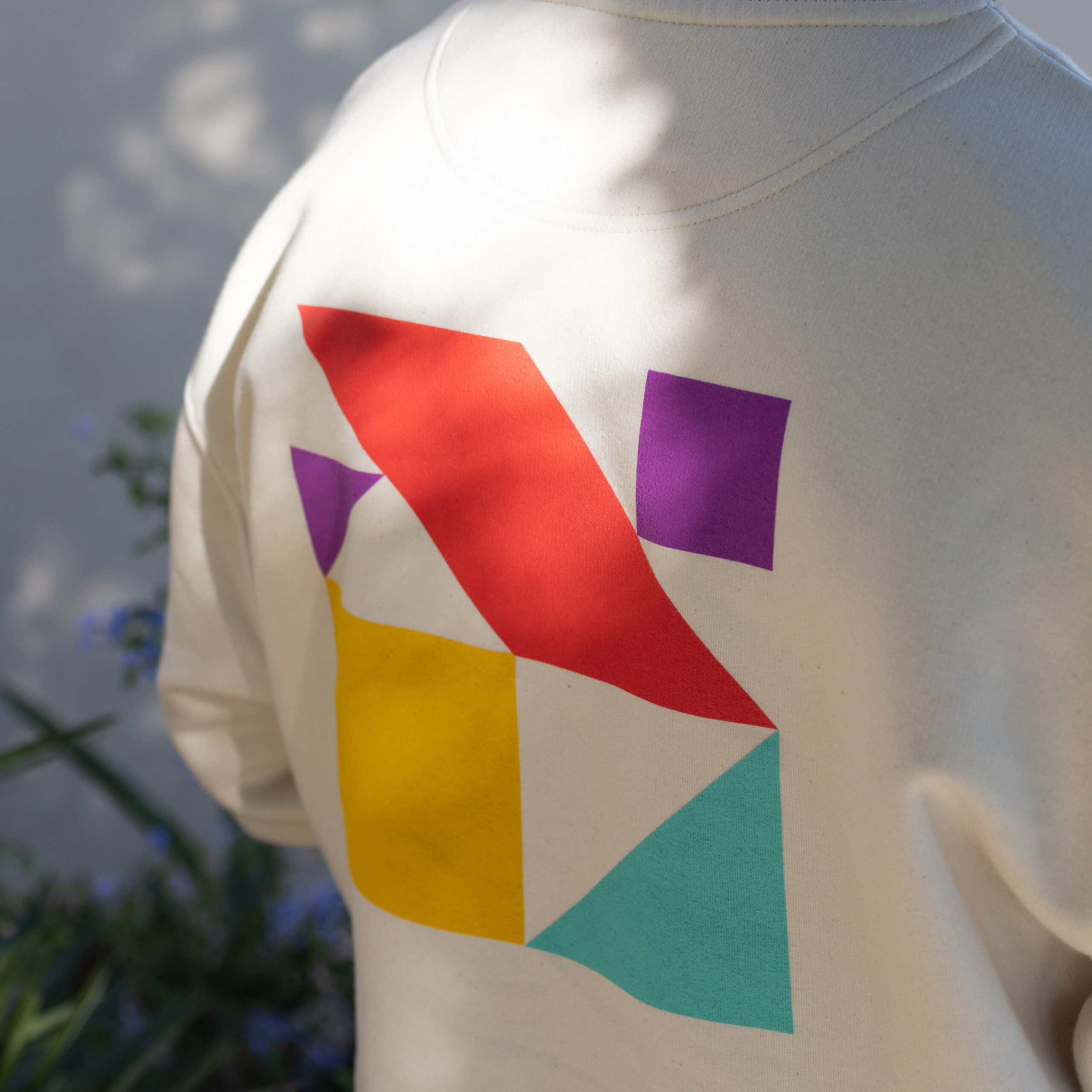
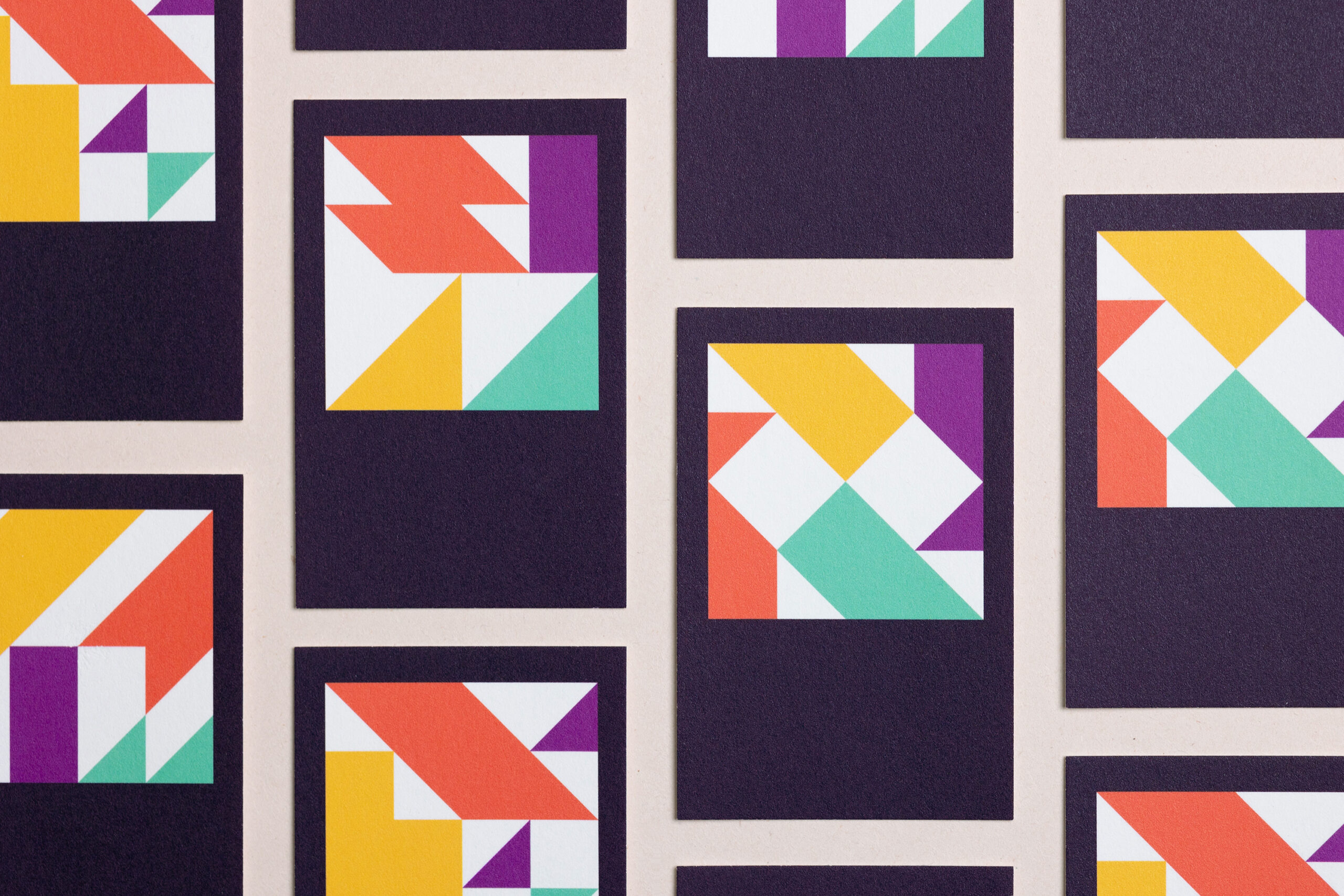
Picpacker’s logo is made up by different combinations of geometric shapes. The flexibility of the mark highlights the versatile mode of practice the studio embodies.
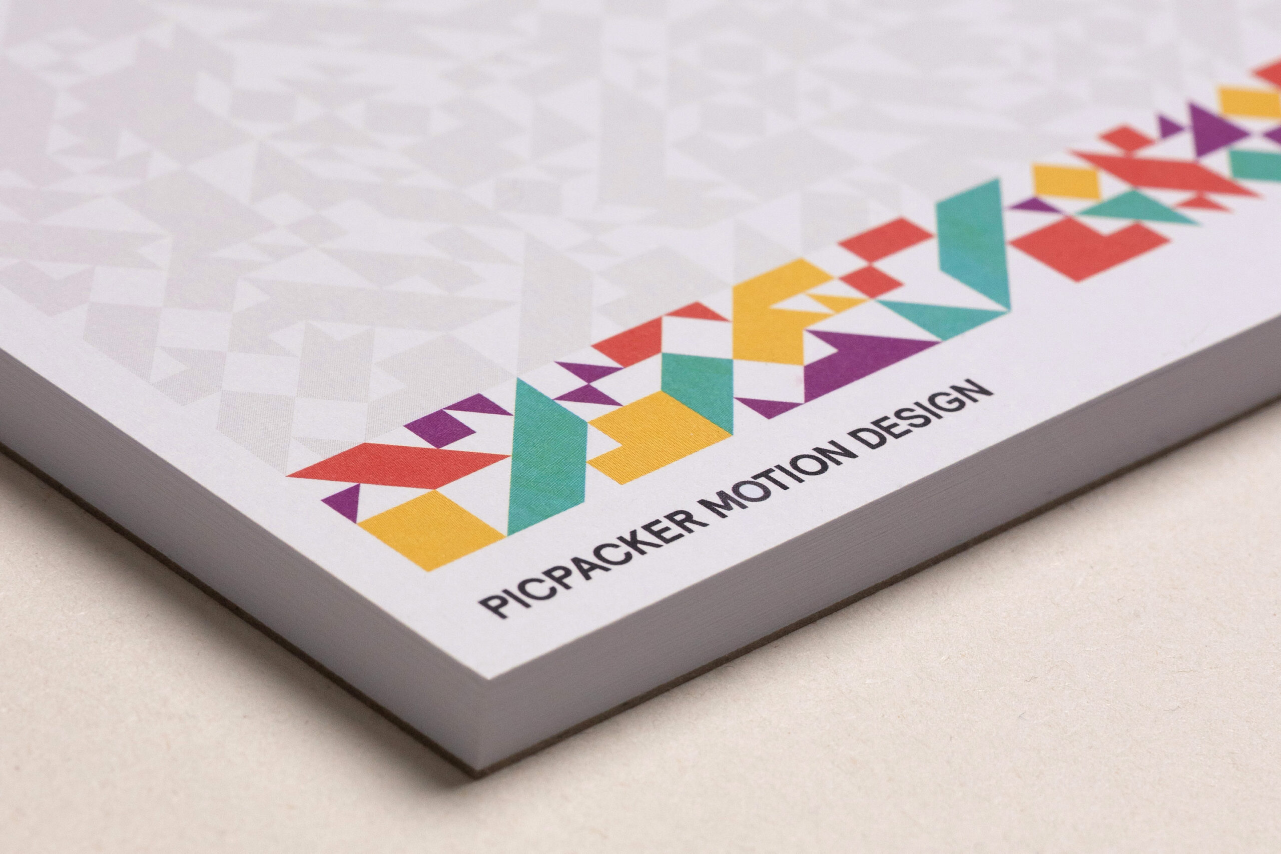
The shapes from the logo make up a
lively pattern that can be used in
printed material like this notepad…
… and is a great tool box for Picpacker
to use in their animations.
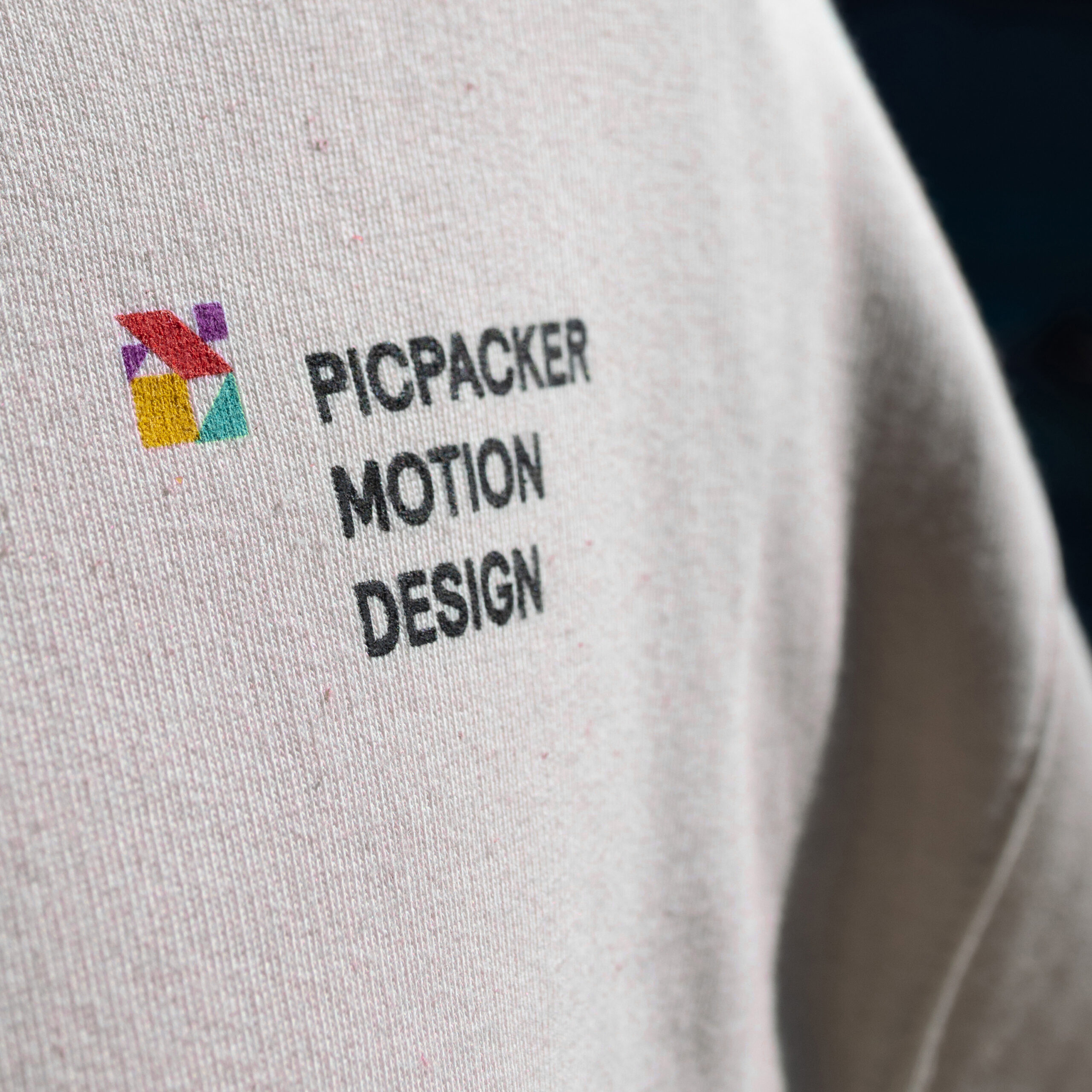
On set the Picpacker team is wearing
branded apparel to let people know
what their up to.
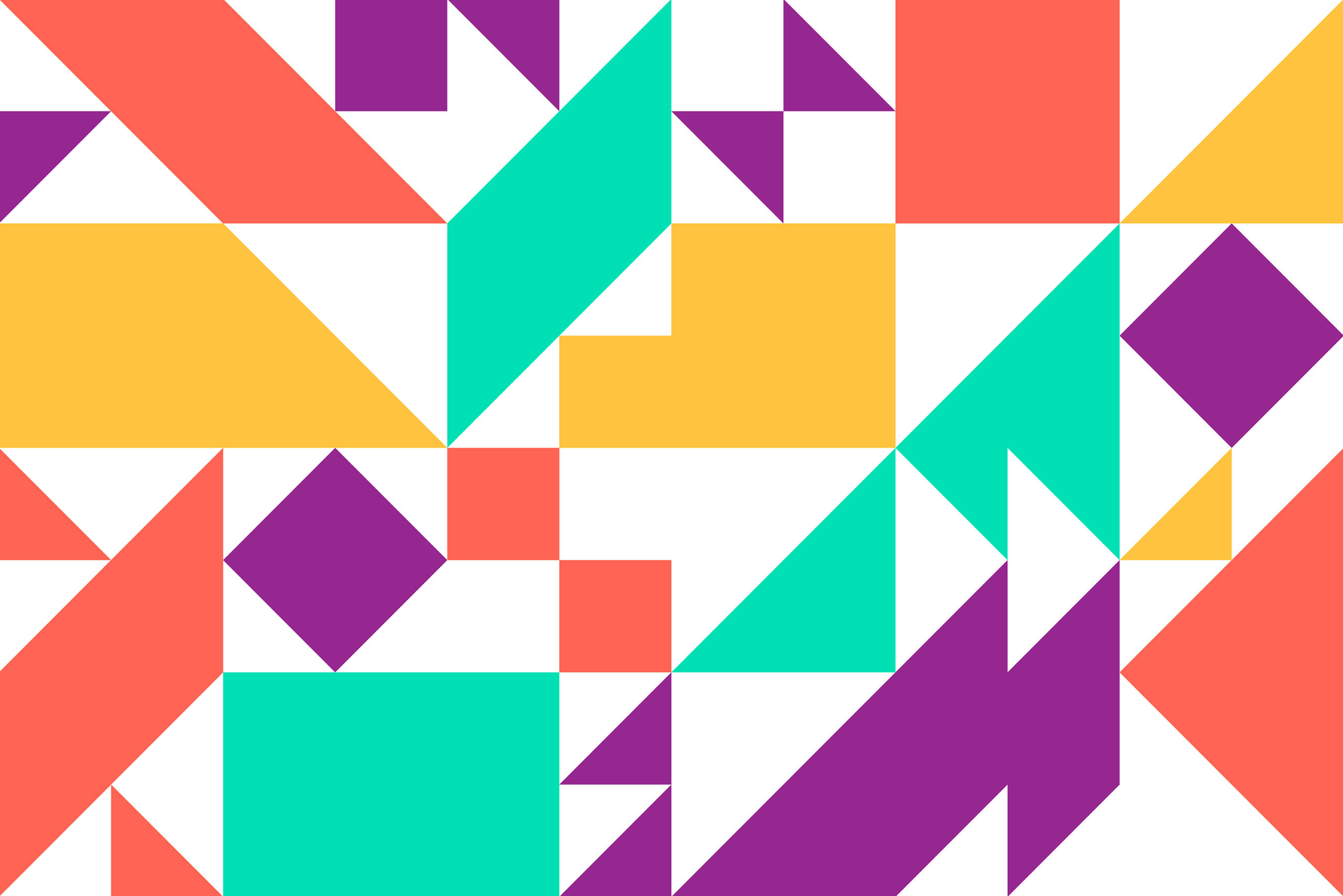
Suggesting movement the geometrical
patterns create a colorful vibrant setting
for Picpacker’s striking imagery.
“Transatlantika’s perfect blend of profound consultation and creative implementation has impressed us greatly.”
Franz Sickinger
Managing Partner at Picpacker
What we did:
- Campaigns
- Illustration
- Marketing
- Printed Goods
→ Project Info
Picpacker Motion Design – Brand Identity
Created in 2024
Client: Picpacker Motion Design
→ Transatlantika Team
Creative Direction & Design: Philipp Zurmöhle
Project Management: Johannes Bösser
Stationery Photography: Robin Tielker
→ View Project on