“Organically setting a path for retail success.”
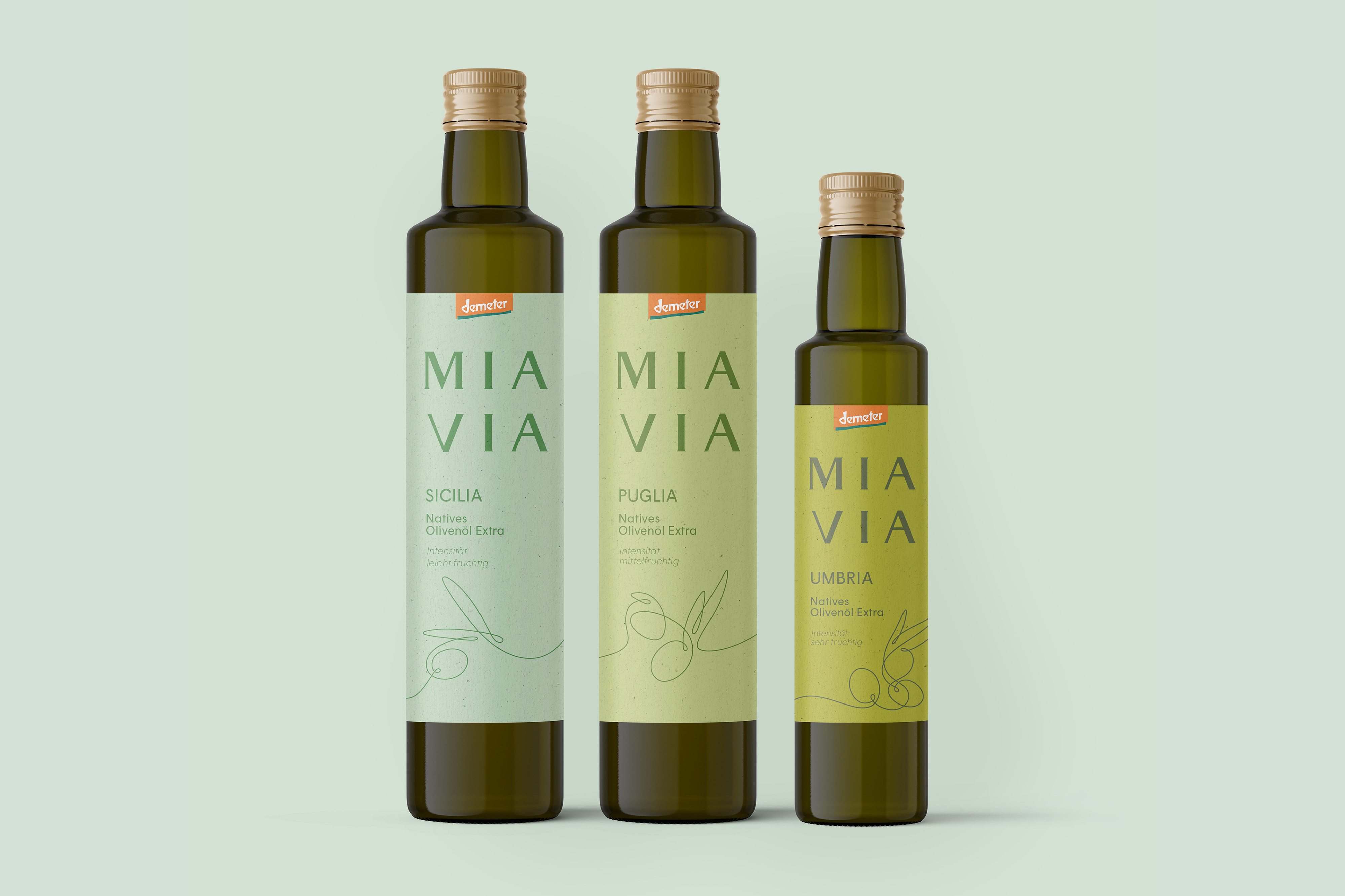
MIA VIA
Brand Identity & Packaging Design
MIA VIA is sourcing fine organic foods only from Italian Demeter certified producers.
Transatlantika, in collaboration with Picpacker Motion Design, created the brand identity including name, logo, packaging, illustrations and a modular color concept to build a brand that is bold and elegant while subtly hinting at the company’s Italian origin.
→ Briefing
The fruit and vegetable distributor Terra from Bolzano, Italy set out to create their own brand for fine food items with an organic “Demeter” certification.
Not happy with initial designs by a different agency, they approached us to rethink what their brand and packaging could look like.
→ Process
In multiple video calls we discussed different directions for naming and design. We presented various possible brand concepts.
Once a concept was agreed on, we created multiple logo designs, followed by layout options for their products’ labels.
→ Solution
It all starts with the name MIA VIA – meaning „my way“ in Italian.
The logo’s typography based on the Capitalis Monumentalis is inspired by ancient roman milestones. This concept of traveling on a path is also expressed in the line illustrations on the labels.
→ Success
A lively new brand covering over 50 products was developed. The range includes olive oils, tomato sauces, pesti, honeys, wines and more.
MIA VIA had a successful market entry and is available in grocery stores in Germany.
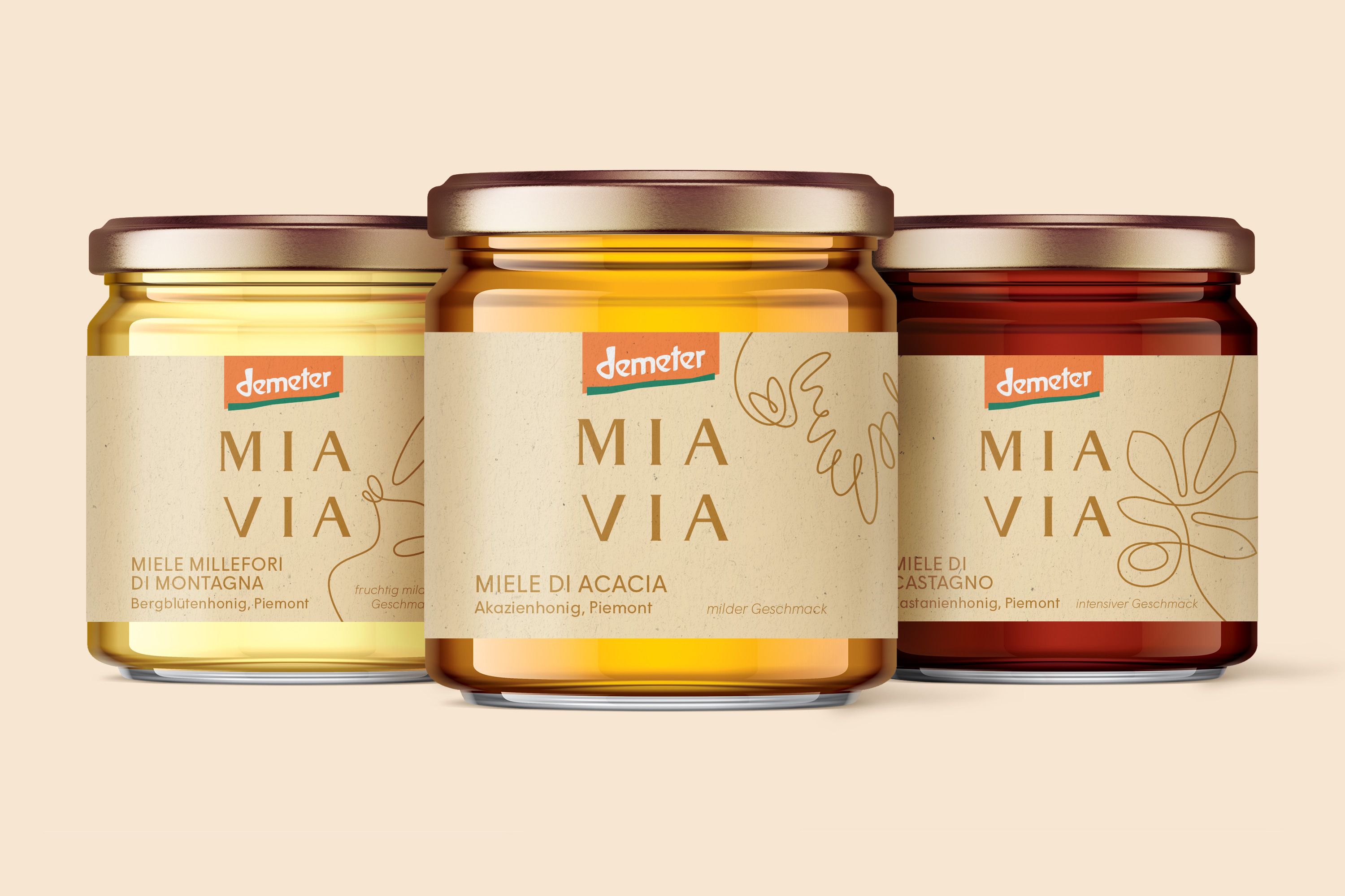
Packaging Design
Different honey flavours with their themed illustrations.
Logo Design & Illustration
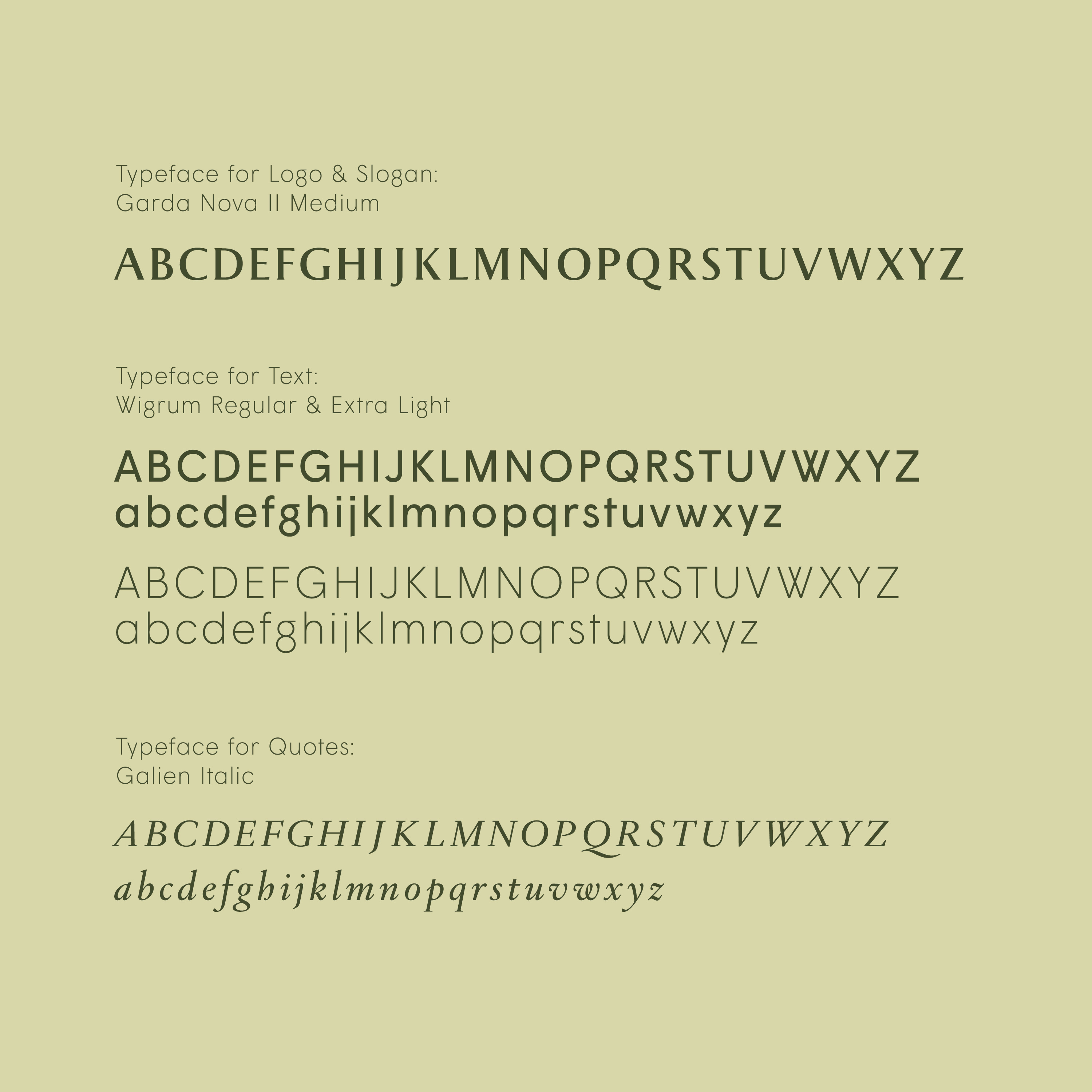
While the font has luxurious classic Italian feel, the generous letter spacing gives the logotype a touch of modernity.
On the product packaging one-liner illustrations of ingredients and characteristic Italian scenes convey the imaginary path traveled – MIA VIA translates to “my way”. →



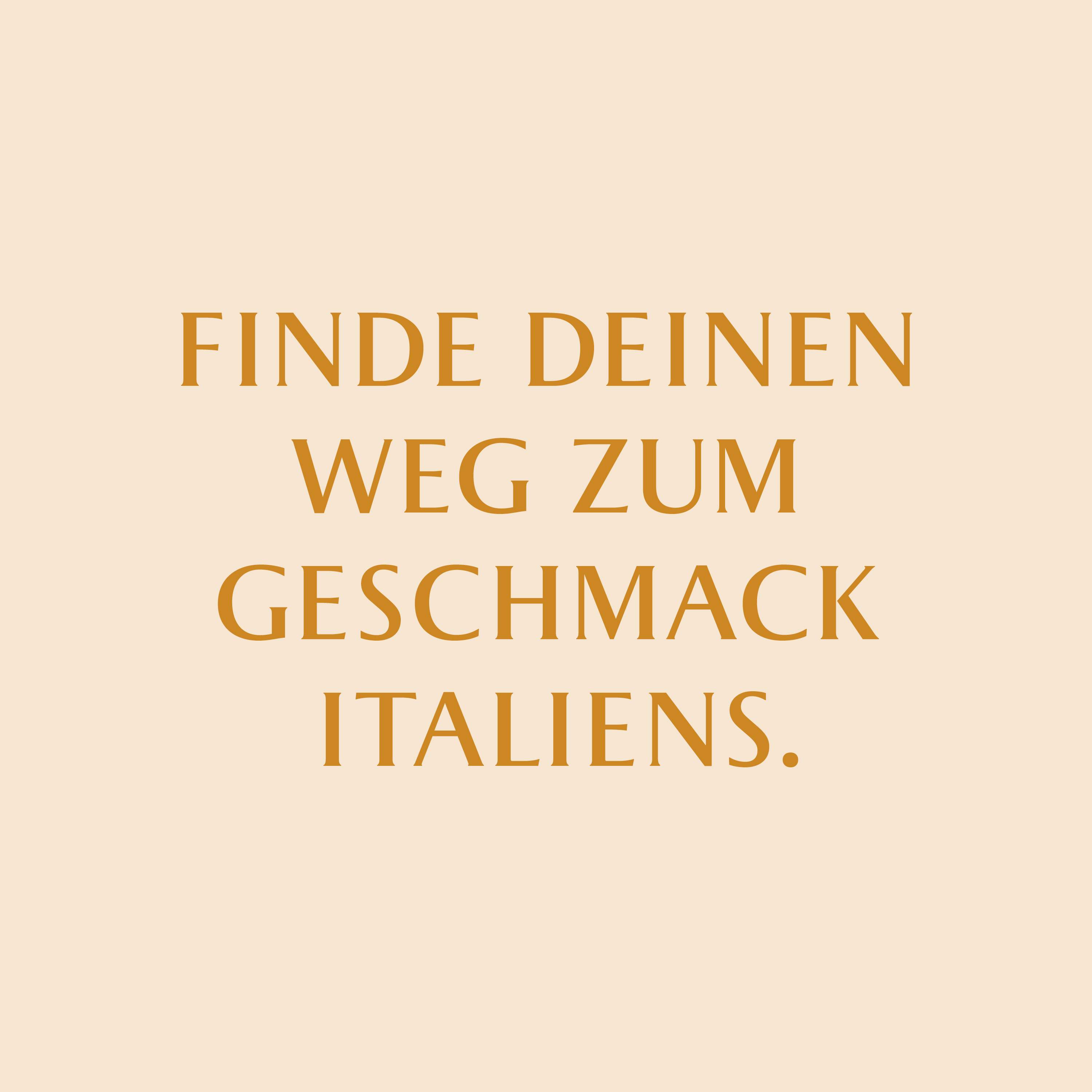
Supporting Monogram & Slogan
The MIA VIA monogram symbol accompanies the logotype and combines the letters M and V from the brand name.
The slogan translates to “Find your way to the flavours of Italy.”
Label Design
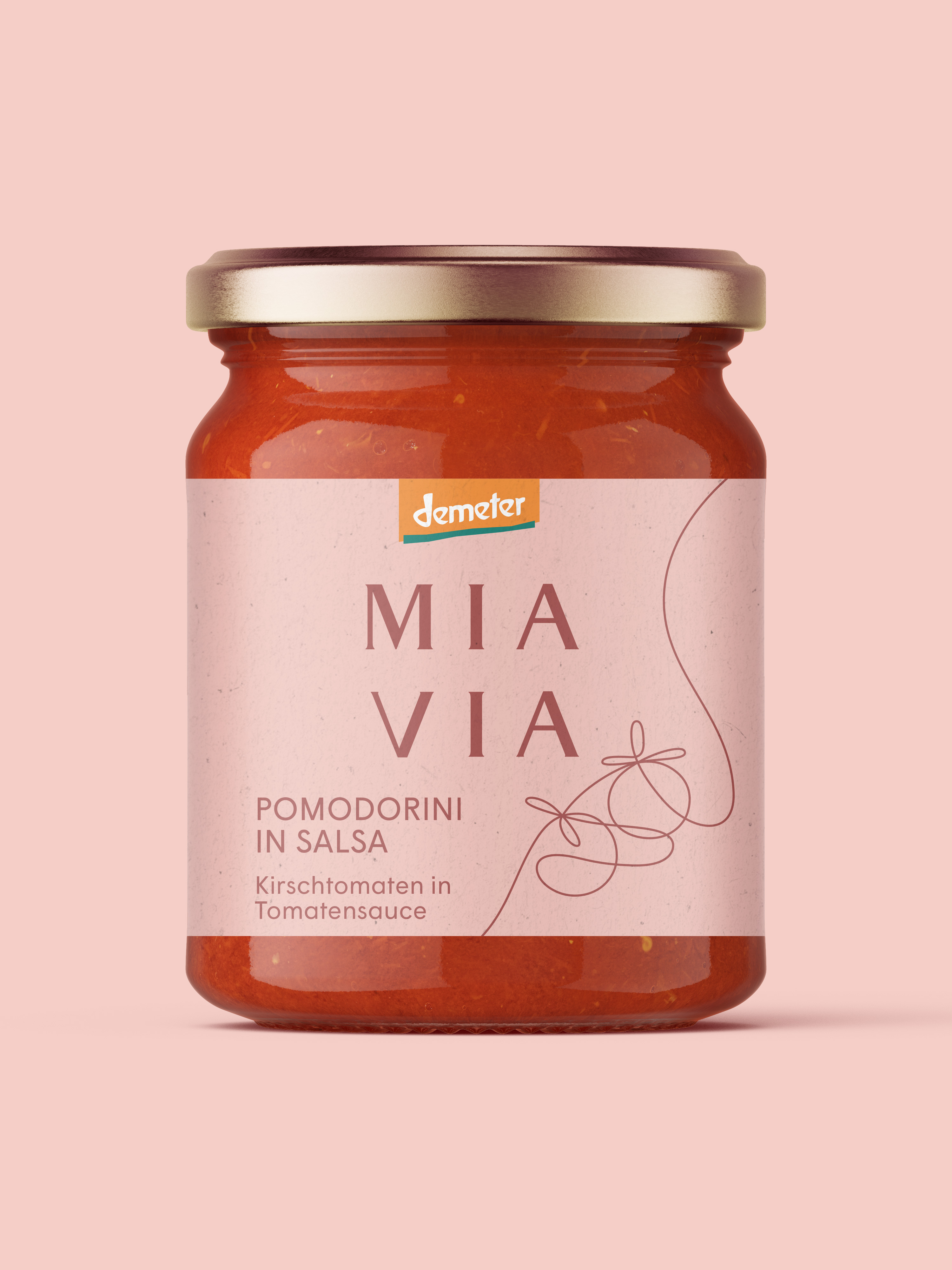
“Pomodorini in Salsa” tomato sauce packaging design and “Polpa di Pomodoro” one-liner illustration.

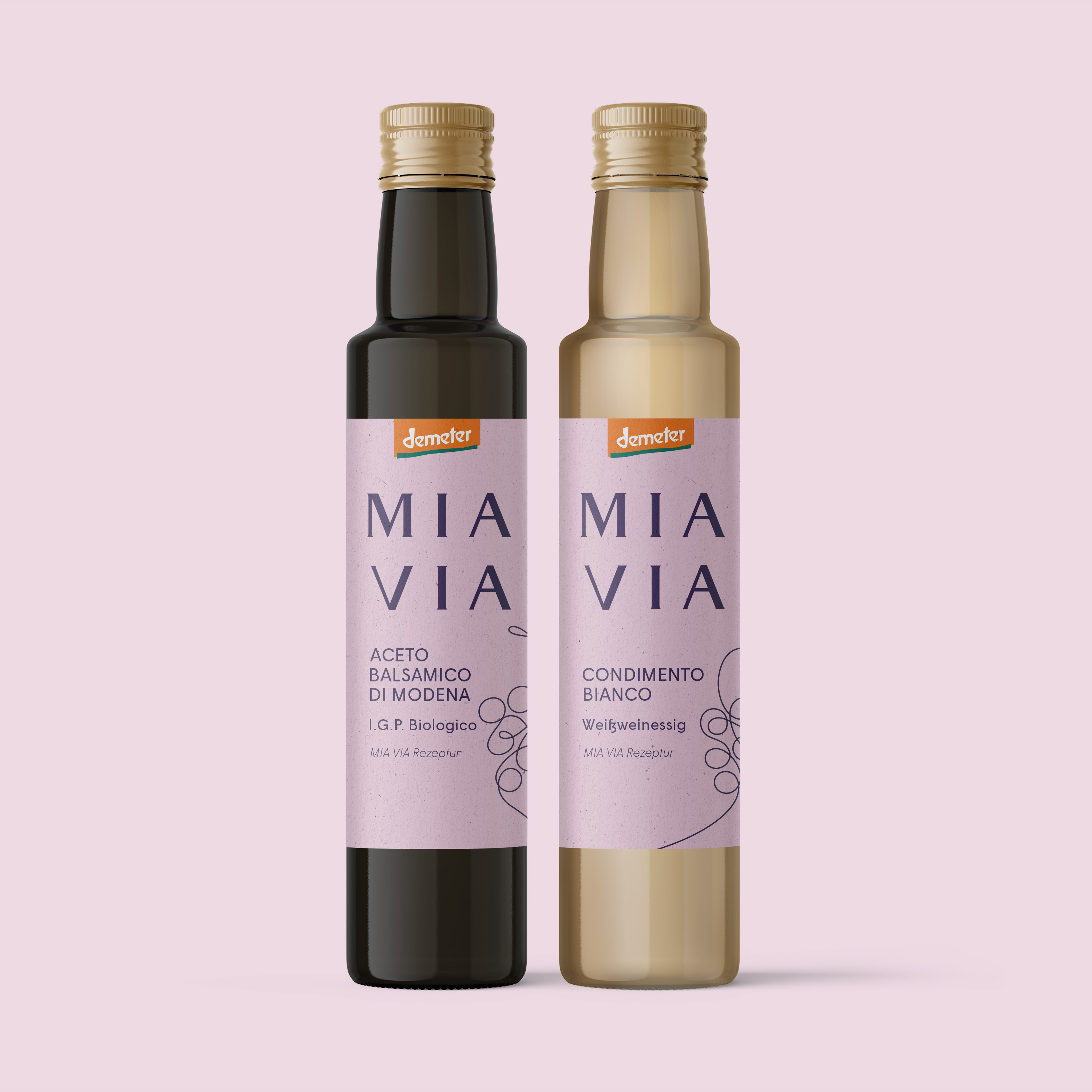
Coloration of the vinegar labels.
Some products feature characteristic Italian motives always following the on-liner path concept.

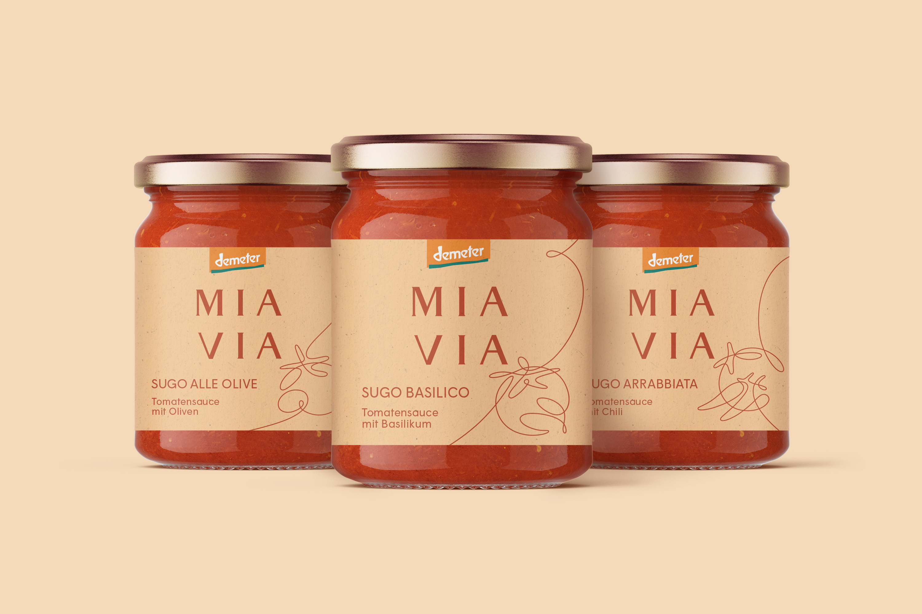
A variety of tomato sauce flavours.
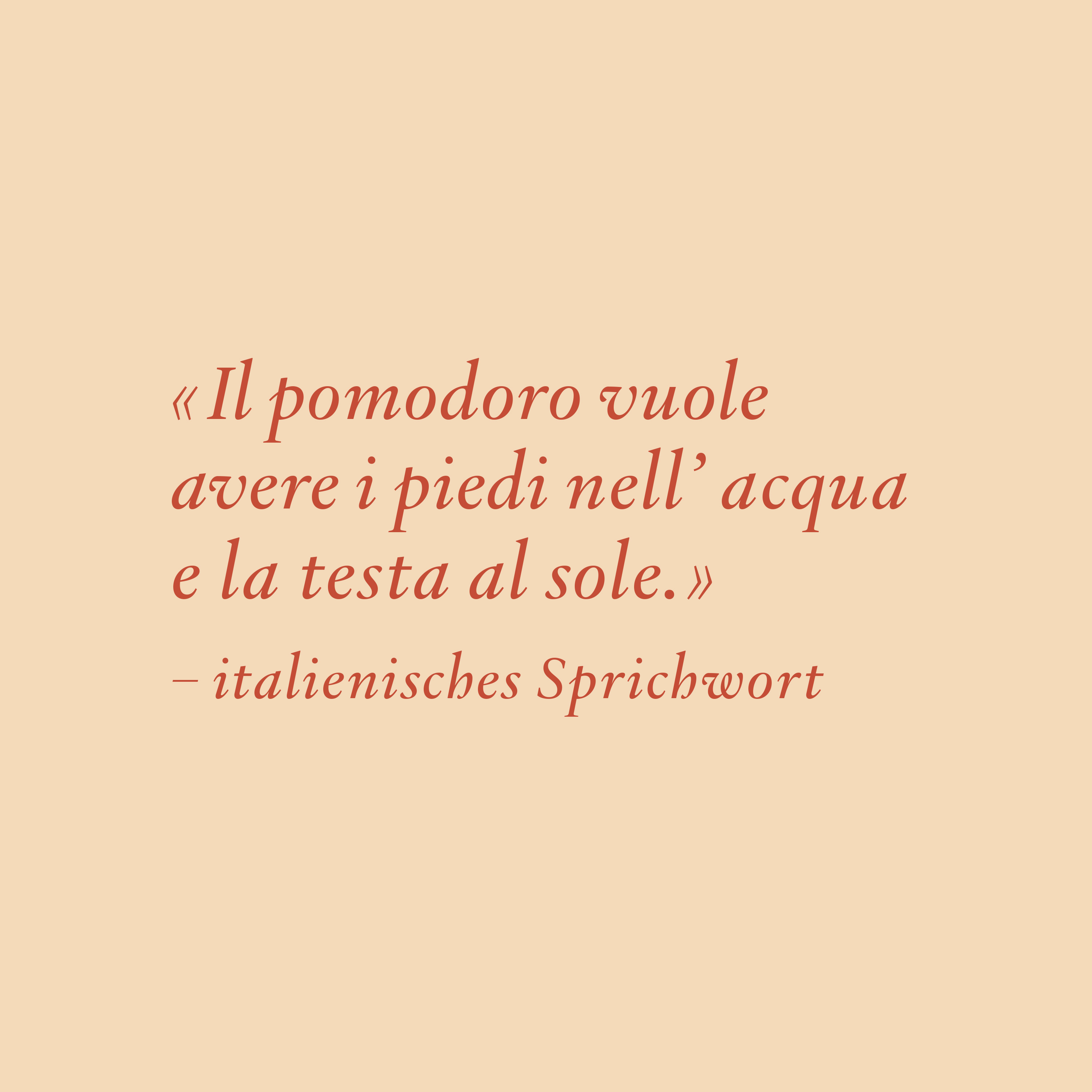
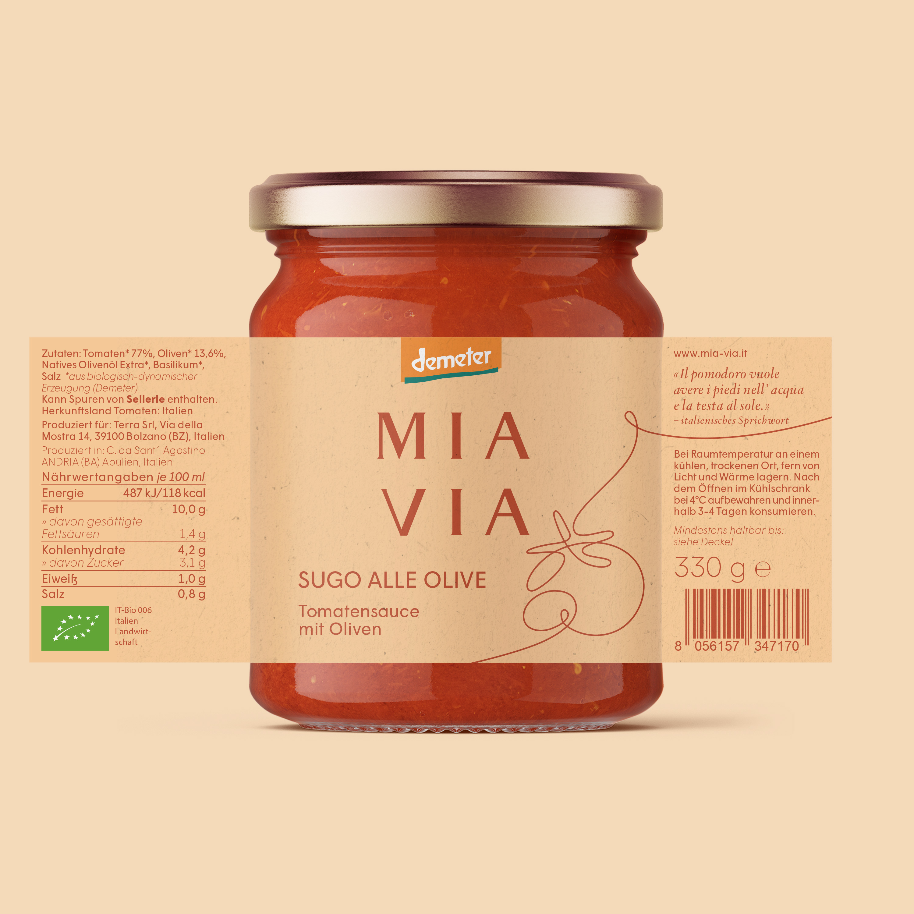
Each packaging features a traditional Italian quote that talks about the product.
The packaging label includes all the mandatory information.
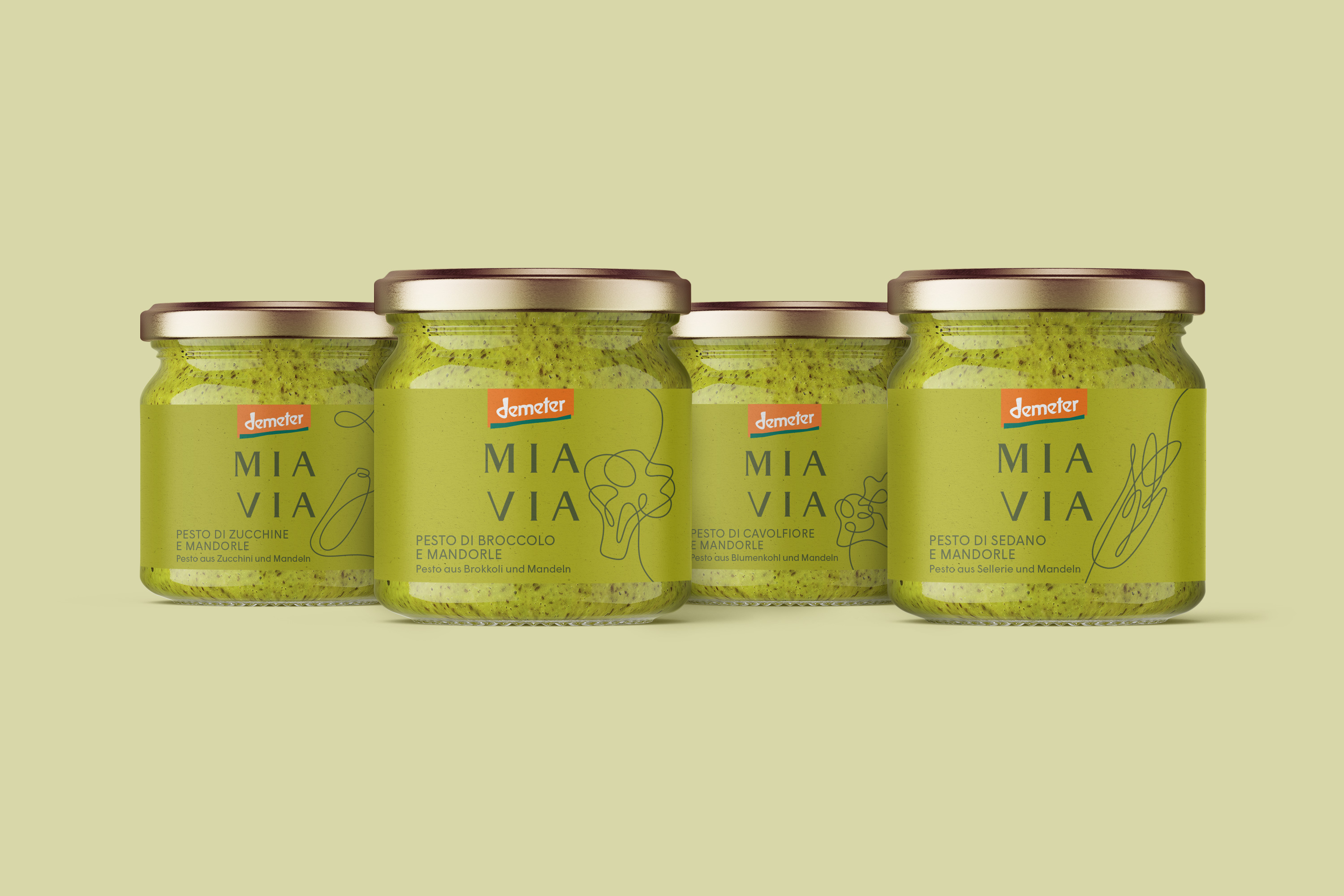
A variety of pesto flavours.
Each packaging features a traditional Italian quote that talks about the product.
The packaging label includes all the mandatory information.
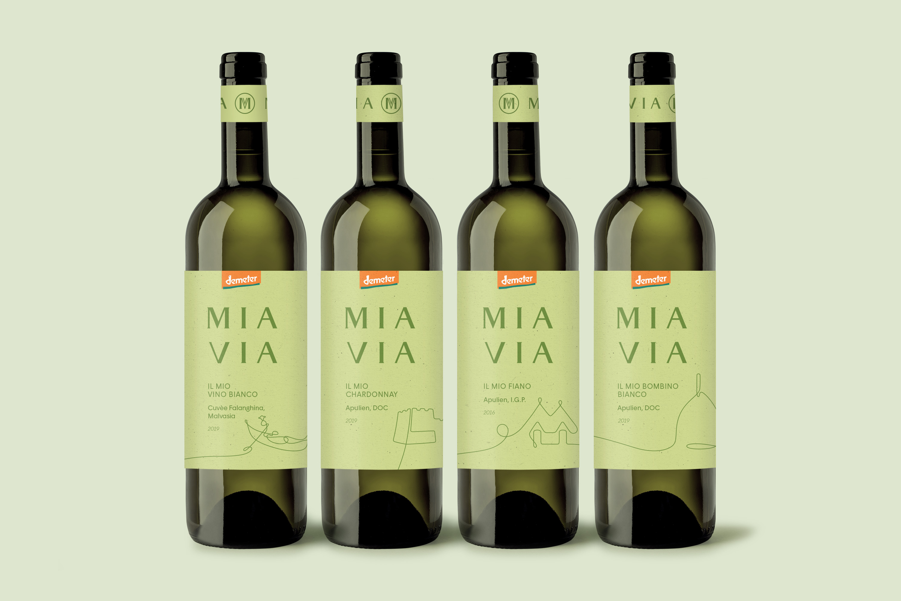
White wine label designs.
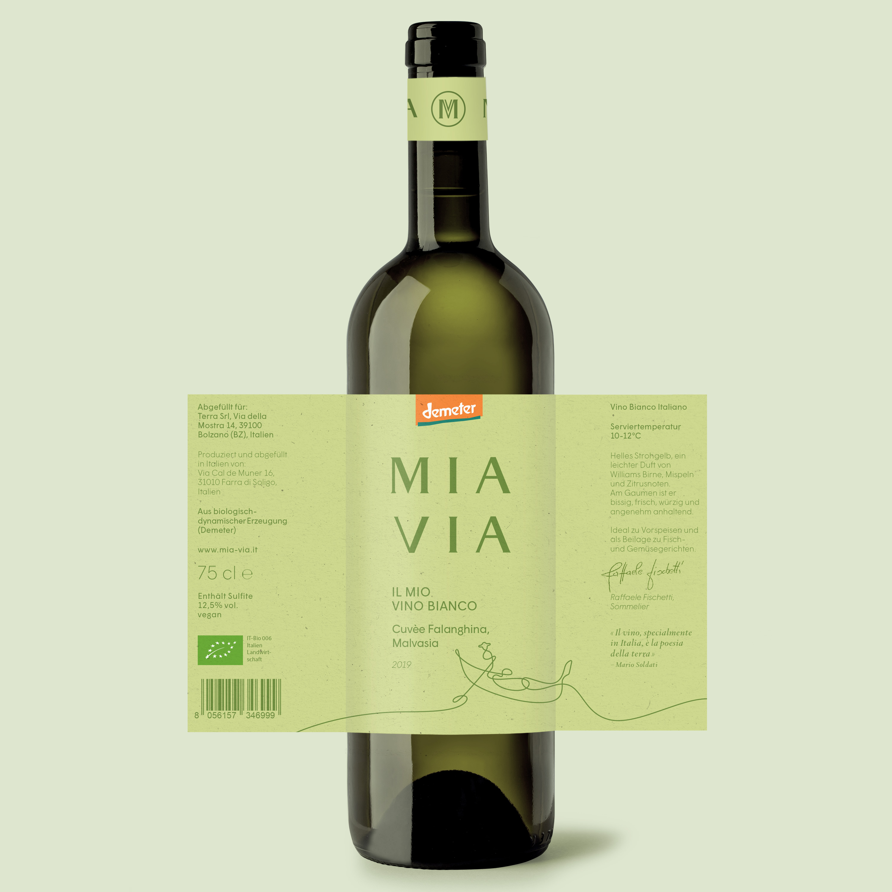
The wine labels include information about what food they can be paired with.
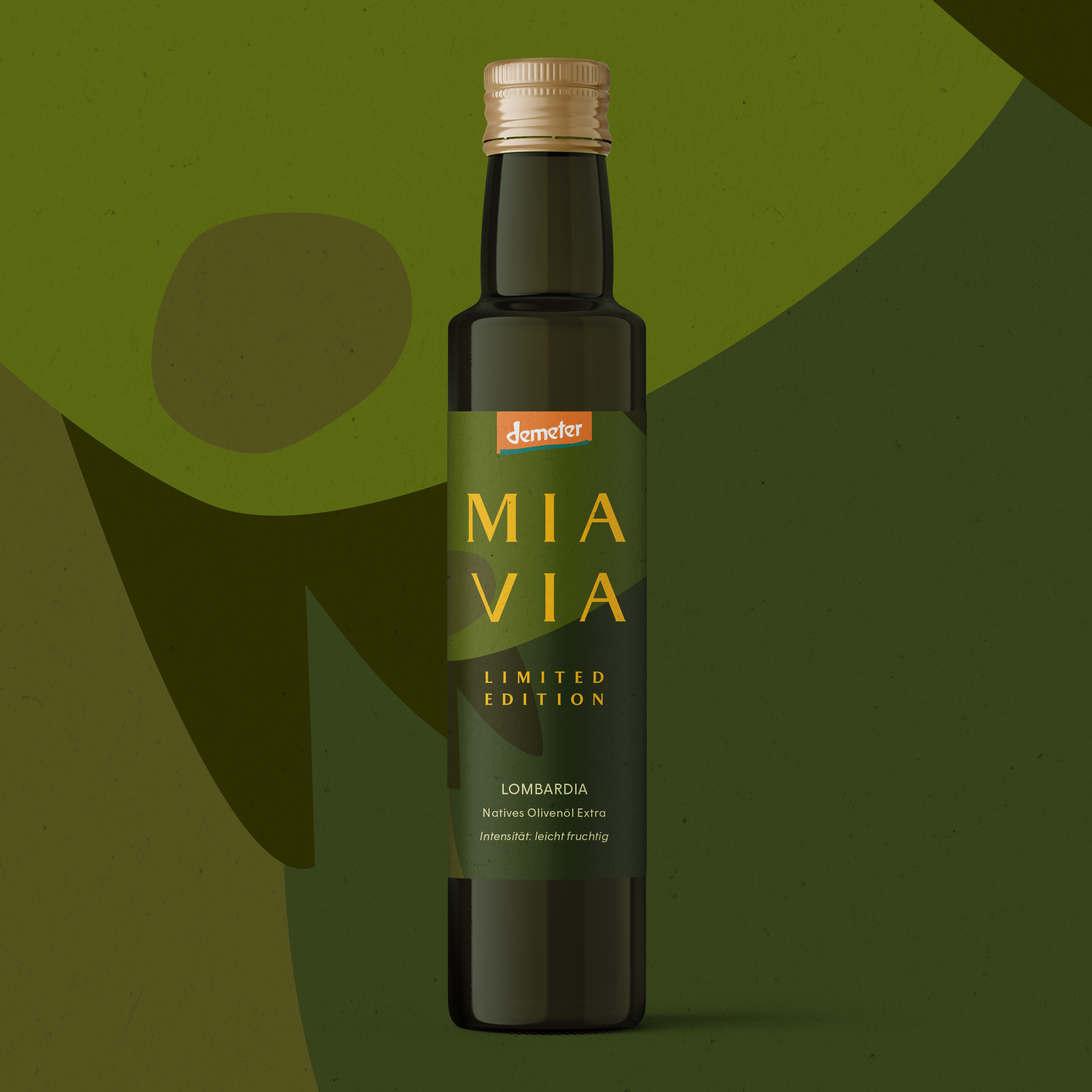
Limited edition labels, like the Lombardia olive oil, make use of full bleed illustrations.
MIA VIA explainer video in collaboration with Picpacker Motion Design.
What we did:
- Brand Identity
- Color Palette
- Illustration
- Logo Design
- Naming
- Packaging Design
- Typography
↓ Project Info
MIA VIA – Brand Identity & Packaging Design
Created in 2021
Client: Terra GmbH
↓ Team
Creative Direction & Design: Philipp Zurmöhle, Nico Vogelsang, Franz Sickinger
Collaborative project with Picpacker Motion Design
↓ View Project on